Suppose you have a binary classifier and two observations; the model scores them as 0.6 and 0.99, respectively. Is there a higher chance that the sample with the 0.99 score belongs to the positive class? For some models, this is true, but for others it might not.
This blog post will dive deeply into probability calibration—an essential tool for every data scientist and machine learning engineer. Probability calibration allows us to ensure that higher scores from our model are more likely to belong to the positive class.
The post will provide reproducible code examples with open-source software so you can run it with your data! We’ll use sklearn-evaluation for plotting and Ploomber to execute our experiments in parallel.
What is probability calibration?
When training a binary classifier, we’re interested in finding whether a specific observation belongs to the positive class. What positive class means depens on the context. For example, if working on an email filter, it can mean that a particular message is spam. If working on content moderation, it can mean harmful post.
Using a number in a real-valued range provides more information than Yes/No answer. Fortunately, most binary classifiers can output scores (Note that here I’m using the word scores and not probabilities since the latter has a strict definition).
Let’s see an example with a Logistic regression:
import matplotlib.pyplot as plt
from sklearn import datasets
from sklearn.linear_model import LogisticRegression
from sklearn.model_selection import train_test_split
from sklearn_evaluation.plot import ConfusionMatrix

# create sample dataset
X, y = datasets.make_classification(1000, 10, n_informative=5, class_sep=0.4, random_state=42)
X_train, X_test, y_train, y_test = train_test_split(X, y, test_size=0.3, random_state=42)

# fit model
clf = LogisticRegression(random_state=42)
_ = clf.fit(X_train, y_train)
The predict_proba function allows us to output the scores (for logistic regression’s case, this are indeeded probabilities):
probas = clf.predict_proba(X_test)
probas[:5]
Console output (1/1):
array([[0.65634472, 0.34365528],
       [0.39870286, 0.60129714],
       [0.64706464, 0.35293536],
       [0.7295771 , 0.2704229 ],
       [0.47656198, 0.52343802]])
Each row in the output represents the probability of belonging to class 0 (first column) or class 1 (second column). As expected, the rows add up to 1.
Intuitively, we expect a model to give a higher probability when it’s more confident about specific predictions. For example, if the probability of belonging to class 1 is 0.6, we might assume the model isn’t as confident as with one example whose probability estimate is 0.99. This is a property exhibited by well-calibrated models.
This property is advantageous because it allows us to prioritize interventions. For example, if working on content moderation, we might have a model that classifies content as not harmful or harmful; once we obtain the predictions, we might decide to only ask the review team to check the ones flagged as harmful, and ignore the rest. However, teams have limited capacity, so it’d be better to only pay attention to posts with a high probability of being harmful. To do that, we could score all new posts, take the top N with the highest scores, and then hand over these posts to the review team.
However, models do not always exhibit this property, so we must ensure our model is well-calibrated if we want to prioritize predictions depending on the output probability.
Let’s see if our logistic regression is calibrated.
import pandas as pd
import numpy as np

# get the probability to belonging to the positive class
prob_positive = probas[:, 1]

# data frame with probabilities and actual labels
df = pd.DataFrame({'prob': prob_positive, 'actual': y_test})

# bin probabilities
df['prob_bin'] = pd.cut(df.prob, bins=np.arange(0, 1.1, 0.1))

df.head()
Console output (1/1):
| prob | actual | prob_bin | |
|---|---|---|---|
| 0 | 0.343655 | 0 | (0.3, 0.4] |
| 1 | 0.601297 | 1 | (0.6, 0.7] |
| 2 | 0.352935 | 0 | (0.3, 0.4] |
| 3 | 0.270423 | 0 | (0.2, 0.3] |
| 4 | 0.523438 | 0 | (0.5, 0.6] |
Let’s now group by probability bin and check the proportion of samples within that bin that belong to the positive class:
df.groupby('prob_bin').actual.mean()
Console output (1/1):
prob_bin
(0.0, 0.1]    0.000000
(0.1, 0.2]    0.000000
(0.2, 0.3]    0.200000
(0.3, 0.4]    0.290323
(0.4, 0.5]    0.514286
(0.5, 0.6]    0.534483
(0.6, 0.7]    0.600000
(0.7, 0.8]    0.900000
(0.8, 0.9]    0.875000
(0.9, 1.0]         NaN
Name: actual, dtype: float64
We can see that the model is reasonably calibrated. No sample belongs to the positive class for outputs between 0.0 and 0.1. For the rest, the proportion of actual positive class samples is close to the value boundaries. For example, for the ones between 0.3 and 0.4, 29% belong to the positive class. A logistic regression returns well-calibrated probabilities because of its loss function.
It’s hard to evaluate the numbers in a table; this is where a calibration curve comes in, allowing us to assess calibration visually.
What is a calibration curve?
A calibration curve is a graphical representation of a model’s calibration. It allows us to benchmark our model against a target: a perfectly calibrated model.
A perfectly calibrated model will output a score of 0.1 when it’s 10% confident that the model belongs to the positive class, 0.2 when it’s 20%, and so on. So if we draw this, we’d have a straight line:
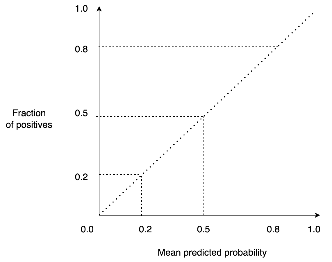
Furthermore, a calibration curve allows us to compare several models. For example, if we want to deploy a well-calibrated model into production, we might train several models and then deploy the one that is better calibrated.
The notebook
We’ll use a notebook to run our experiments and change the model type (e.g., logistic regression, random forest, etc.) and the dataset size. You can see the source code here.
The notebook is straightforward: it generates sample data, fits a model, scores out-of-sample predictions, and saves them. After running all the experiments, we’ll download the model’s predictions and use them to plot the calibration curve along with other plots.
Running the experiments
To accelerate our experimentation, we’ll use Ploomber Cloud, which allows us to parametrize and run notebooks in parallel.
Note: the commands in this section as bash commands. Run them in a terminal or add the %%sh magic if you execute them in Jupyter.
Let’s download the notebook:
curl -O https://raw.githubusercontent.com/ploomber/posts/master/calibration-curve/fit.ipynb
Console output (1/1):
% Total    % Received % Xferd  Average Speed   Time    Time     Time  Current
                                 Dload  Upload   Total   Spent    Left  Speed
100 55224  100 55224    0     0   379k      0 --:--:-- --:--:-- --:--:--  379k
Now, let’s run our parametrized notebook. This will trigger all our parallel experiments:
ploomber cloud nb fit.ipynb
Console output (1/1):
Uploading fit-f3b37722.ipynb...
Triggering execution of fit-f3b37722.ipynb...
Done. Monitor Docker build process with:
  $ ploomber cloud logs 25ee1b3d-d7d6-4683-8024-f8ccac71b388 --image --watch
After a minute or so, we’ll see that all our 28 experiments are finished executing:
ploomber cloud status @latest --summary
Console output (1/1):
status      count
--------  -------
finished       28

Pipeline finished. Check outputs:
  $ ploomber cloud products
Let’s download the probability estimations:
ploomber cloud download 'calibration-curve/*.parquet' --summary
Console output (1/1):
Downloaded 56 files.
Loading output
Each experiment stores the model’s predictions in a .parquet file. Let’s load the data to generate a data frame with the model type, sample size, and path to the model’s probabilities (as generated by the predict_proba method).
from glob import glob
import re

import numpy as np
import pandas as pd
from sklearn.datasets import make_classification
from sklearn.model_selection import train_test_split

from sklearn_evaluation import plot

def parse_params(path):
    """Parse the parameters from a given path
    """
    params = path.replace('calibration-curve/output/', '')
    result = re.search(r"output-model=(.+)-n_samples=(.+)-\d{1,2}\.parquet", params)
    name, n_samples = result.groups()
    return {'name': name, 'n_samples': n_samples, 'path': path}

# list all output files
paths = glob('calibration-curve/**/*.parquet')

# load them into a data frame so we can filter experiments
df = pd.DataFrame([parse_params(path) for path in paths])
df['n_samples'] = df.n_samples.astype(int)
df = df.sort_values(by=['name', 'n_samples'])
df.head()
Console output (1/1):
| name | n_samples | path | |
|---|---|---|---|
| 16 | sklearn.discriminant_analysis.QuadraticDiscrim... | 1000 | calibration-curve/output/output-model=sklearn.... |
| 12 | sklearn.discriminant_analysis.QuadraticDiscrim... | 10000 | calibration-curve/output/output-model=sklearn.... |
| 14 | sklearn.discriminant_analysis.QuadraticDiscrim... | 100000 | calibration-curve/output/output-model=sklearn.... |
| 26 | sklearn.discriminant_analysis.QuadraticDiscrim... | 1000000 | calibration-curve/output/output-model=sklearn.... |
| 15 | sklearn.ensemble.AdaBoostClassifier | 1000 | calibration-curve/output/output-model=sklearn.... |
name is the model name. n_samples is the sample size, and path is the path to the output data generated by each experiment.
Logistic regression: a well-calibrated model
Logistic regression is a special case since it’s well-calibrated by design given that its objective function minimizes the log-loss function.
Let’s see its calibration curve:
import matplotlib.pyplot as plt

def load_output(df):
    """Load output generated in the experiments
    """
    probs = [pd.read_parquet(path) for path in df.path]
    names = df.n_samples
    return probs, names

def plot_calibration_curve(y_true, probs, names, ax=None):
    """Plot calibration curve
    """
    if ax is None:
        fig, ax = plt.subplots()
        fig.set_figheight(4)
        fig.set_figwidth(6)
        fig.set_dpi(150)

    plot.calibration_curve(y_true, probs, names, ax=ax)
    ax.grid()

def plot_from_query(df, query, ax=None):
    """Filter experiments and plot calibration curve
    """
    lr = df.query(query)
    data, names = load_output(lr)
    probs = [d.prob.values for d in data]
    y_true = [d.y_true.values for d in data]
    plot_calibration_curve(y_true, probs, list(names), ax=ax)
plot_from_query(df, ('name == "sklearn.linear_model.LogisticRegression"'
                     'and n_samples == 1000_000'))
Console output (1/1):
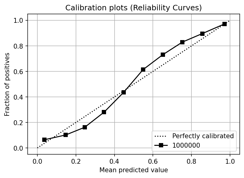
You can see that the probability curve closely resembles one of a perfectly calibrated model.
The effect of the sample size
In the previous section, we showed that logistic regression is designed to produce calibrated probabilities. But beware of the sample size. If you don’t have a large enough training set, the model might not have enough information to calibrate the probabilities. The following plot shows the calibration curves for a logistic regression model as the sample size increases:
plot_from_query(df, 'name == "sklearn.linear_model.LogisticRegression"')
Console output (1/1):
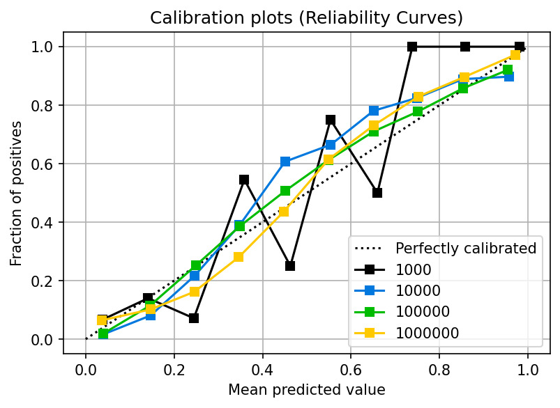
You can see that with 1,000 samples, the calibration is poor. However, once you pass 10,000 samples, more data does not significantly improve the calibration. Note that this effect depends on the dynamics of your data; you might need more or fewer data in your use case.
Non-calibrated estimators
While a logistic regression is designed to produce calibrated probabilities, other models do not exhibit this property. Let’s look at the calibration plot for an AdaBoost classifier:
plot_from_query(df, 'name == "sklearn.ensemble.AdaBoostClassifier"')
Console output (1/1):
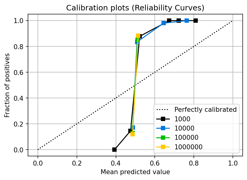
You can see that the calibration curve looks highly distorted: the fraction of positives (y-axis) is far from its corresponding mean predicted value (x-axis); furthermore, the model doesn’t even produce values along the full 0.0 to 1.0 axis.
Even at a sample size of 1000,000, the curve could be better. In upcoming sections, we’ll see how to address this problem, but for now, remember this: not all models will produce calibrated probabilities by default. In particular, maximum margin methods such as boosting (AdaBoost is one of them), SVMs, and Naive Bayes yield uncalibrated probabilities (Niculescu-Mizil and Caruana, 2005).
AdaBoost (unlike logistic regression) has a different optimization objective that does not produce calibrated probabilities. However, this does not imply an inaccurate model since classifiers are evaluated by their accuracy when creating a binary response. Let’s compare the performance of both models.
def load_experiment(name, n_samples):
    """Load output from a single experiment
    """
    path = df[(df.name == name)
              & (df.n_samples == n_samples)].path
    return pd.read_parquet(path.iloc[0])

ada = load_experiment('sklearn.ensemble.AdaBoostClassifier', 1000)
lr = load_experiment('sklearn.linear_model.LogisticRegression', 1000)
Now we plot and compare the classification metrics. AdaBoost’s metrics are displayed in the upper half of each square, while Logistic regression ones are in the lower half. We’ll see that both models have similar performance:
cr_ada = plot.ClassificationReport(ada.y_true,
                                   ada.prob >= 0.5)

cr_lr = plot.ClassificationReport(lr.y_true,
                                  lr.prob >= 0.5)

# compare classification reports
cr_ada + cr_lr
Console output (1/1):
The importance of the probabilities distribution
Until now, we’ve solely used the calibration curve to judge whether a classifier is calibrated. However, another crucial factor to take into account is the distribution of the model’s predictions. That is, how common or rare score values are.
Let’s look at the random forest calibration curve:
fig, (ax1, ax2) = plt.subplots(ncols=2)
fig.set_figheight(5)
fig.set_figwidth(10)
fig.set_dpi(150)

plot_from_query(df, 'name == "sklearn.ensemble.RandomForestClassifier"', ax=ax1)
plot_from_query(df, 'name == "sklearn.linear_model.LogisticRegression"', ax=ax2)

ax1.set_title('Random Forest')
_ = ax2.set_title('Logistic Regression')
Console output (1/1):
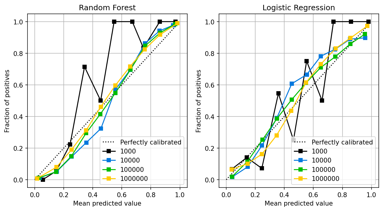
The random forest follows a similar pattern as the logistic regression: the larger the sample size, the better the calibration. Random forests are known to provide well-calibrated probabilities (Niculescu-Mizil and Caruana, 2005).
However, this is only part of the picture. First, let’s look at the distribution of the output probabilities:
fig, (ax1, ax2) = plt.subplots(ncols=2)
fig.set_figheight(4)
fig.set_figwidth(8)
fig.set_dpi(150)

rf = load_experiment('sklearn.ensemble.RandomForestClassifier', 100_000)
_ = plot.scores_distribution(rf.prob, ax=ax1)
ax1.set_ylim(0, 15000)

lr = load_experiment('sklearn.linear_model.LogisticRegression', 100_000)
_ = plot.scores_distribution(lr.prob, ax=ax2)
ax2.set_ylim(0, 15000)

ax1.set_title('Random Forest')
_ = ax2.set_title('Logistic Regression')

fig.tight_layout()
Console output (1/1):
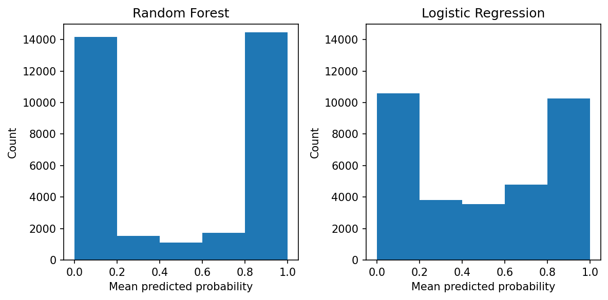
We can see that the random forest pushes the probabilities towards 0.0 and 1.0, while the probabilities from the logistic regression are less skewed. While the random forest is calibrated, there aren’t many observations in the 0.2 to 0.8 region. On the other hand, the logistic regression has support all along the 0.0 to 1.0 area.
An even more extreme example is when using a single tree: we’ll see an even more skewed distribution of probabilities.
exp = load_experiment('sklearn.tree.DecisionTreeClassifier', 100_000)

fig, ax = plt.subplots()
_ = plot.scores_distribution(exp.prob, ax=ax)
fig.set_figheight(4)
fig.set_figwidth(6)
fig.set_dpi(150)
Console output (1/1):
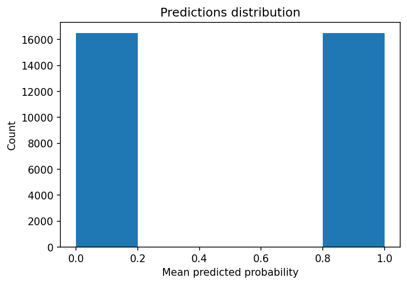
Let’s look at the probability curve:
plot_from_query(df, 'name == "sklearn.tree.DecisionTreeClassifier"')
Console output (1/1):
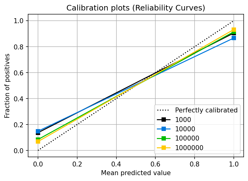
You can see that the two points we have (0.0, and 1.0) are calibrated (they’re reasonably close to the dotted line). However, no more data exists because the model didn’t output probabilities with other values.
Calibrating a classifier
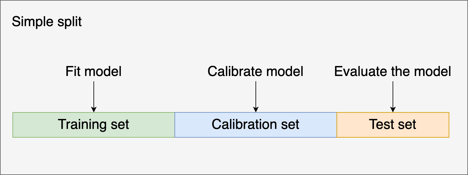
There are a few techniques to calibrate classifiers. They work by using your model’s uncalibrated predictions as input for training a second model that maps the uncalibrated scores to calibrated probabilities. We must use a new set of observations to fit the second model. Otherwise, we’ll introduce bias in the model.
There are two widely used methods: Platt’s method and Isotonic regression. Platt’s method is recommended when the data is small. In contrast, Isotonic regression is better when we have enough data to prevent overfitting (Niculescu-Mizil and Caruana, 2005).
Consider that calibration won’t automatically produce a well-calibrated model. The models whose predictions can be better calibrated are boosted trees, random forests, SVMs, bagged trees, and neural networks (Niculescu-Mizil and Caruana, 2005).
Remember that calibrating a classifier adds more complexity to your development and deployment process. So before attempting to calibrate a model, ensure there aren’t more straightforward approaches to take such a better data cleaning or using logistic regression.
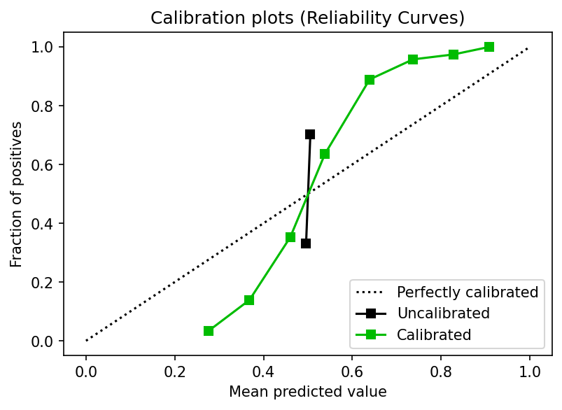
Let’s see how we can calibrate a classifier using a train, calibrate, and test split using Platt’s method:
from sklearn.ensemble import AdaBoostClassifier
from sklearn.svm import LinearSVC
from sklearn.linear_model import LogisticRegression
from sklearn import metrics
from sklearn import datasets

from sklearn_evaluation import plot

X, y = datasets.make_classification(100000, 10, n_informative=8,
                                    class_sep=0.5, random_state=42)

X_, X_test, y_, y_test = train_test_split(X, y, test_size=0.3, random_state=42)
X_train, X_calib, y_train, y_calib = train_test_split(X_, y_, test_size=0.4, random_state=42)

# uncalibrated model
clf = AdaBoostClassifier(n_estimators=50)
y_proba = clf.fit(X_train, y_train).predict_proba(X_test)

# calibrated model
calibrator = LogisticRegression()

calibrator.fit(clf.predict_proba(X_calib), y_calib)

y_proba_calib = calibrator.predict_proba(y_proba)

fig, ax = plt.subplots()
plot.calibration_curve(y_test,
                       [y_proba, y_proba_calib],
                       clf_names=['Uncalibrated', 'Calibrated'],
                       ax=ax)
fig.set_figheight(4)
fig.set_figwidth(6)
fig.set_dpi(150)
Console output (1/1):
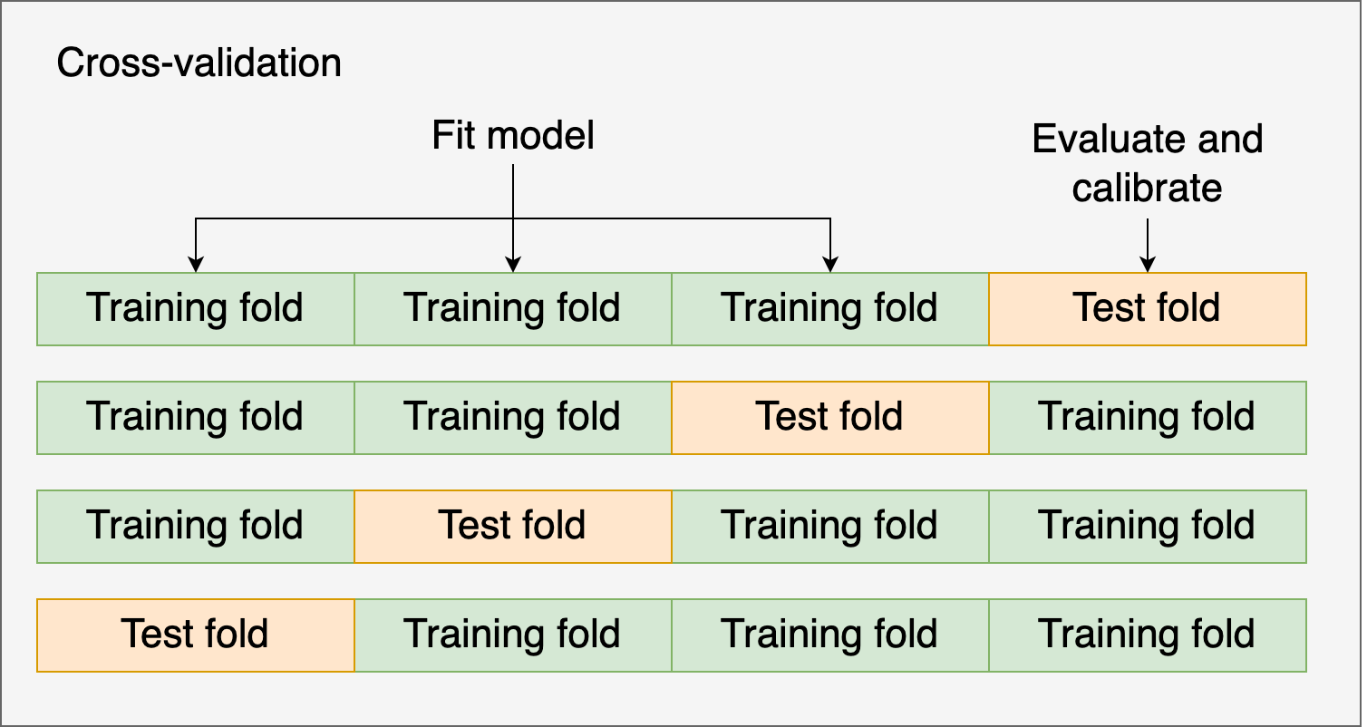
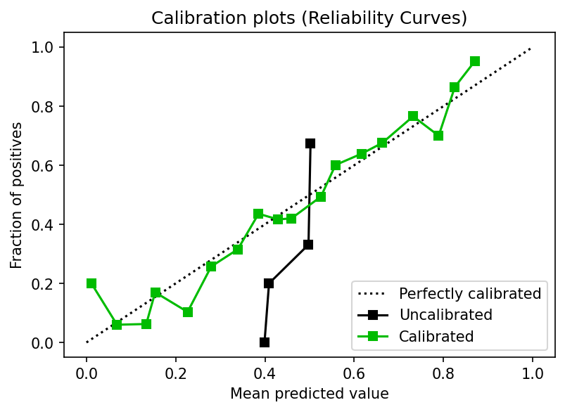
Alternatively, you might use cross-validation and the test fold to evaluate and calibrate the model. Let’s see an example using cross-validation and Isotonic regression:
from sklearn import datasets
from sklearn import metrics
from sklearn.model_selection import train_test_split
from sklearn.ensemble import AdaBoostClassifier
from sklearn.calibration import CalibratedClassifierCV
from sklearn.model_selection import cross_val_predict

from sklearn_evaluation import plot

X, y = datasets.make_classification(10000, 10, n_informative=8,
                                    class_sep=0.5, random_state=42)

X_train, X_test, y_train, y_test = train_test_split(X, y, test_size=0.3, random_state=42)

clf = AdaBoostClassifier(n_estimators=100)
clf_calib = CalibratedClassifierCV(base_estimator=clf,
                                   cv=3,
                                   ensemble=False,
                                   method='isotonic')
clf_calib.fit(X_train, y_train)

y_proba = clf_calib.predict_proba(X_test)

y_proba_base = clf.fit(X_train, y_train).predict_proba(X_test)

fig, ax = plt.subplots()
plot.calibration_curve(y_test,
                       [y_proba_base[:, 1], y_proba[:, 1]],
                       clf_names=["Uncalibrated", "Calibrated"],
                       n_bins=20)
fig.set_figheight(4)
fig.set_figwidth(6)
fig.set_dpi(150)
Console output (1/1):
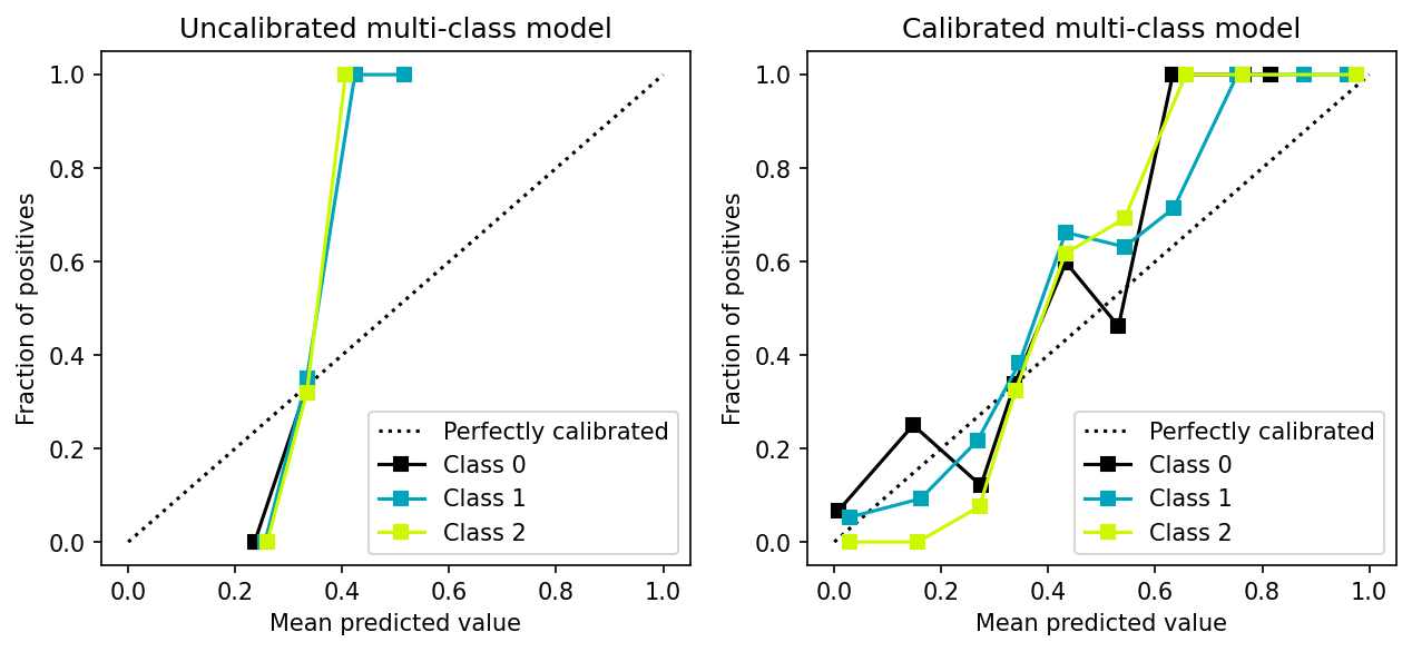
Calibrating a multi-class model
In the previous section, we discussed methods for calibrating a classifier (Platt’s method and Isotonic regression), which only support binary classification.
However, calibration methods can be extended to support multiple classes by following the one-vs-all strategy as shown in the following example:
from sklearn import datasets
from sklearn.multiclass import OneVsRestClassifier
from sklearn.ensemble import AdaBoostClassifier
from sklearn.calibration import CalibratedClassifierCV

X, y = datasets.make_classification(5000, 10, n_informative=5,
                                    class_sep=0.3, random_state=42,
                                    n_classes=3)

X_train, X_test, y_train, y_test = train_test_split(X, y, test_size=0.3, random_state=42)

base = AdaBoostClassifier()
calib = CalibratedClassifierCV(base_estimator=base, cv=3, ensemble=False)
final = OneVsRestClassifier(calib)

y_proba_raw = OneVsRestClassifier(base).fit(X_train, y_train).predict_proba(X_test)
y_proba = final.fit(X_train, y_train).predict_proba(X_test)

fig, (ax1, ax2) = plt.subplots(ncols=2)
fig.set_figheight(4)
fig.set_figwidth(10)
fig.set_dpi(150)

# uncalibrated model
plot.calibration_curve([y_test == 0, y_test == 1, y_test == 2],
                       [y_proba_raw[:, 0], y_proba_raw[:, 1], y_proba_raw[:, 2]],
                       clf_names=['Class 0', 'Class 1', 'Class 2'],
                       ax=ax1)
ax1.set_title("Uncalibrated multi-class model")

# calibrated model
plot.calibration_curve([y_test == 0, y_test == 1, y_test == 2],
                       [y_proba[:, 0], y_proba[:, 1], y_proba[:, 2]],
                       clf_names=['Class 0', 'Class 1', 'Class 2'],
                       ax=ax2)
_ = ax2.set_title("Calibrated multi-class model")
Console output (1/1):
Closing remarks
In this blog post, we took a deep dive into probability calibration, a practical tool that can help you develop better predictive models. We also discussed why some models exhibit calibrated predictions without extra steps while others need a second model to calibrate their predictions. Through some simulations, we also demonstrated the sample size’s effect and compared several models' calibration curves.
To run our experiments in parallel, we used Ploomber Cloud, and to generate our evaluation plots, we used sklearn-evaluation. Ploomber Cloud has a free tier, and sklearn-evaluation is open-source, so you can grab this post in notebook format from here, get an API Key and run the code with your data.
If you have questions, feel free to join our community!
References
- Probability calibration (scikit-learn documentation)
- Calibrating a classifier (scikit-learn documentation)
- Probability calibration notes from David S. Rosenberg
- Classification: Prediction Bias
- Predicting Good Probabilities With Supervised Learning. Alexandru Niculescu-Mizil and Rich Caruana (2005)
Packages used
Here are the versions we used for the code examples:
pip freeze | grep -E 'scikit-learn|pandas|matplotlib|numpy|ploomber|sklearn'
Console output (1/1):
matplotlib==3.6.2
matplotlib-inline==0.1.6
numpy==1.23.4
pandas==1.5.1
ploomber==0.21.6
ploomber-core==0.0.6
ploomber-engine==0.0.10
ploomber-scaffold==0.3.1
scikit-learn==1.1.3
sklearn-evaluation==0.7.8


