


Hello everyone, welcome back to my post discussing causal inference and experimentation with regression discontinuity designs in Python. In Part II (the thing you’re reading right now!), I illustrate how to build Bayesian regression discontinuity designs (RDDs) in PyMC. If you are unfamiliar with theory governing causal inference frameworks, I encourage you to check out my high level explanation in Part I.
Note: This post got a bit longer than expected - so I’m only covering model building and the intuitions behind model building. In Part III (upcoming), I show how causal inference pipelines can be parameterized and evaluated in the cloud using Ploomber!
Now for Part II specifics: I will cover model building in PyMC and model validation in araviz library. For the purposes of this example, I utilized PyMC’s RDD example code but added some twists. I generate some synthetic data (which you won’t have to do in the real world) and then build out a sharp regression model based on this data. I discuss the modeling process' mathematics (albeit, briefly) and their underlying intuitions. I present ways to validate inference, particularly assumptions governing MCMC sampling and normality. If this sounds like word soup (to some degree, I’m right there with you), don’t worry, I will try and explain things in plain English!
Now presenting for your viewing pleasure: Part II!
Before we introduce Ploomber’s tools for our analysis, we need to construct our sharp regression discontinuity model. Here is a brief overview of this process (sans code):
PyMC to define our Bayesian model’s priors. I cover some of the assumptions that dictate the features of our model, and some of the assumptions that are not present in a sharp RDD modelaraviz libraries. Specifically, we validate our random variables' MCMC sampling procedures and resulting posterior distributionsPyMC to understand the distributions of our treated/untreated dataNOTE: For each step, a code snipped is attached. For formatting purposes, I either import my function or provide it in full (this was based on how code blocks affected formatting). The full code (it’s better documented) can be found at this GitHub repo should you choose to explore possibilities outside of these snippets.
generate_dataDisclaimer: It may be trivial to mention, but one should remember that data generation is not a necessary step in the experimentation process. Data will be ‘generated’ by the phenomenon you are testing. I simply create mock data for illustration purposes.
Our generated data is made up of three features: a continuous running variable, a binary indicator for treatment status, and a target variable.
Our data generation function is designed around a normally-distributed running variable (RV). Our RV’s mean is located at the eligibility threshold, and has normally distributed variation around this mean. I note that the mean of our data does not necessarily need to serve as the eligibility threshold and vice versa. For the purposes of the data generation function, it is just a matter of convenience.
In the function, treatment status (the after_cutoff parameter below) may be assigned before or after our eligibility threshold. Ultimately, the post-program target is a linear combination of the RV and treatment indicator.
ONE MORE NOTE: I didn’t include the full generate_data function in the block below (it was very long). I encourage you to explore the function’s full script to get a better understanding of how the data is generated. Specifically, it accounts for several unique scenarios underlying the data:
These four scenarios were implemented to account for different (possible) interpretations of RVs and target variables should you choose to experiment with the data on your own. Further modifications can be made in universal modeling parameters (predominately, the sign and magnitude of our observed discontinuity), but this is left up to the reader to determine. For now, I am going with a very simple implementation. With this being said, onto the code:
Note: some packages needed to be installed prior to installation. Run the following command
pip install numpy pymc arviz pandas matplotlib seaborn
# Load packages and scripts
import numpy as np
from dataset import generate_data

# Initialize random state value for reproducability
SEED = 16121515132518 #Ploomber
random_state = np.random.default_rng(SEED)

# Declare data generation parameters
N = 10**4 # number of observations
TE = 2 # treatment effect we evaluate post-policy
STD = 0.3 # noise between pre-post changes in Y values, no measurement error
ELIGIBILITY_THRESHOLD = 5 #cutoff point

# Generate data into pandas dataFrame
df = generate_data(SEED, N, STD, ELIGIBILITY_THRESHOLD, TE, positive_slope= True, after_cutoff= True)

df.head(15)
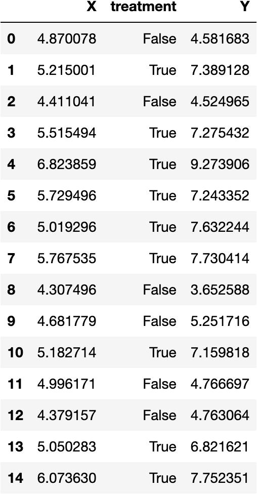
Output of our data generation function. Image generated by the author.
Okay, here are the first 15 observations from our generate_data function. I’ll walk through the more ‘abstract’ parameters that I’ve defined in the function to give you a better understanding of our data’s empirical distribution and observable features.
TE: This is our data’s treatment effect, or change from an implemented policy, or the ‘size’ of the observed discontinuitySTD: This represents normally-distributed variation around our RV, specifically the ‘noise’ around the means of our treatment and control regressions.positive_slope: When True (this is the case in our example), the data follows a positive association between the RV and target variable. When False, there is a negative association.after_cutoff: When True (also the case in this example), data is treated when RV values are greater than the eligibility threshold. Otherwise, the data is treated for RV values less than the threshold.We can create a preliminary visualization to get a better understanding of our data. I utilize the data_scatterplot function imported from visuals.py.
from visuals import data_scatterplot

#visualizations adjust for the eligbility threshold specified
data_scatterplot(df, ELIGIBILITY_THRESHOLD)
The data_scatterplot function is relatively simple. Utilizing our generated data and our pre-specified eligibility threshold, we plot our treatment and control observations separately. We then add a vertical line demarcating the eligibility threshold.
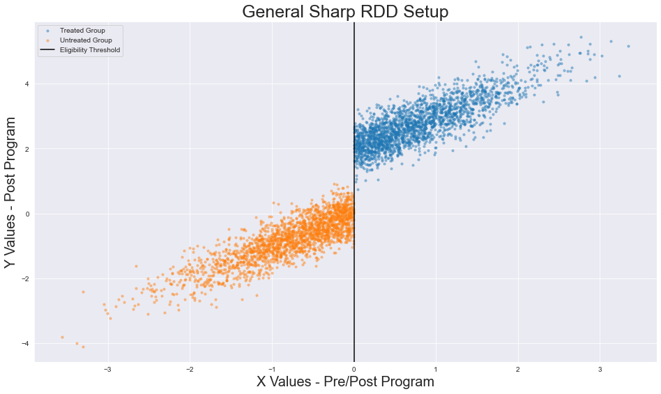
Output of our visualization function. Image generated by the author.
So far, nothing interesting has occurred. We have created data utilizing a specified set of parameters and then visualized it. In the following sections, though, I urge you to forget the underlying parameters of our data generation function. IRL, we will not be able to ascertain the real treatment effect (TE) or validate that our data’s variance is normally distributed (STD). Our job will be to build our model, validate its assumptions, and estimate its (apparent) effects given the observed data.
We turn to PyMC to estimate our model’s underlying parameters from the data’s empirical distribution. We also use it to verify if the parameters actually make sense in the context of our model. This process will be described in (somewhat) painful detail shortly.
generate_data if you’re feeling adventurousThe data_generation function, if you choose to try this notebook out for yourself, can be manipulated for a variety of experimental scenarios.
In the code block below, I show how our data can be modified to fit different scenarios. We can call the data generation function and modify some of our parameters to fit different treatment and control distributions:
import numpy as np
from dataset import generate_data

# Initialize random state value for reproducability
SEED = 16121515132518
random_state = np.random.default_rng(SEED)

# Declare Data Generation Parameters
N = 10**4
TE = -2 # modified
STD = 0.3
ELIGIBILITY_THRESHOLD = 10 # modified

# Generate data into Pandas DataFrame
df = generate_data(SEED, N, STD, ELIGIBILITY_THRESHOLD, TE, positive_slope= False, after_cutoff= False) # final 2 arguments modified

# Visualize distribution of empirical dataset
data_scatterplot(df, ELIGIBILITY_THRESHOLD)
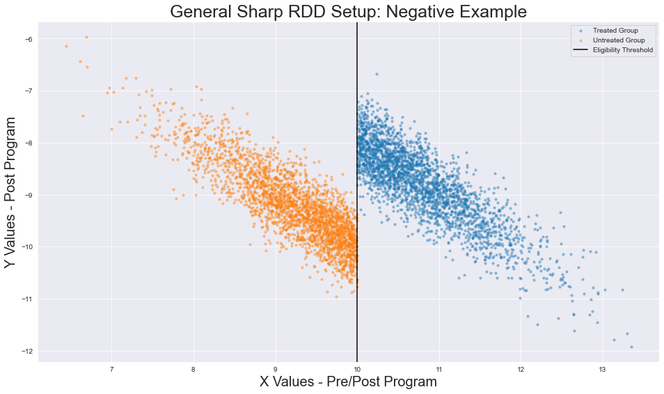
Modified data generation functions. Image generated by the author.
I modified the following parameters:
X < 10)X = 10 instead of x=5)Delta is negative),X and Y)If you want more details on how to modify the data to fit a variety of experimental scenarios, check out generate_data's docstring for more details. I encourage you to test your knowledge of RDD validation later on using different data generation parameters.
Now that we have our synthetic data, we can build out our Bayesian regression discontinuity model. I follow along closely with PyMC’s example here.
Our model is comprised of several random variables that describe the observed data in our generate_data function.
$$\Delta$$
Delta: Cauchy distributed prior representing our treatment effect’s magnitude. We can leverage a Cauchy distribution’s heavier tails when PyMC samples from our priors to generate a posterior (stationary) distribution. Intuitively, think of Delta as a point which changes the intercept of our regression model when an observation is treated. Delta can be modeled as:$$\Delta \sim \textrm{Cauchy}(t,1) $$
$$\textrm{Where the mean is the eligibility threshold } t \textrm{ and variation is } 1. $$
$$\sigma$$
sigma: Half Normal distributed prior that serves as a measure of variance in the mean of our pre-post program y values. We use a Half Normal distributed random variable (instead of a Normally distributed Random Variable) because negative variance would not make sense in our case. Intuitively, sigma represents the noise around our regressions.$$\mu$$
mu: Deterministic variable (i.e. variable that does not contribute noise to our model) that serves as the mean of our outcome y. We are using the same running variable before and after we apply treatment. Thus, the effect for a treated observation i can be represented as follows:$$ treatment_i \textrm{ is a binary variable representing individual treatment status. 1 indicates treatment, 0 otherwise.}$$
$$y$$
y: Normally distributed variable outcome of our running variable. Delta and sigma help us assert that the mean mu of our distribution is normally distributed around a linear regression with variance sigma. Thus y is modeled as:$$y \sim \textrm{Normal}(\mu, \sigma)$$
The remainder of our analysis will be devoted to parameter validation. Specifically, we can analyze our data’s empirical distribution to determine whether it satisfies normality assumptions governed by linear regression. At a minimum, we should validate these assumptions before making claims about the effects of our RDD.
def train_model(data, eligibility_threshold, random_seed, positive_slope = True):

    with pm.Model() as trained_mod:

    # Feed in treatment indicator, X values for observations
        treated_obs = pm.MutableData("treated_obs", data.treatment, dims="obs_id")
        x_vals = pm.MutableData("x_vals", data.X, dims="obs_id")

        # Model parameters specified
        effect_size = pm.Cauchy("effect", alpha=eligibility_threshold, beta=1)
        s = pm.HalfNormal("sigma", 1)

        # Determine mean of our regression lines
        if positive_slope == True:
            u = pm.Deterministic("mu", x_vals + (effect_size * treated_obs), dims="obs_id")
        else:
            u = pm.Deterministic("mu", - x_vals + (effect_size * treated_obs), dims="obs_id")
        # Resulting y values
        obs = pm.Normal("y", mu=u, sigma=s, observed=data.Y, dims="obs_id")


    # Get inference data
    with trained_mod:
        inf_data = pm.sample(cores=1, random_seed=random_seed)

    return trained_mod, inf_data

mod, inference_data = train_model(df, ELIGIBIITY_THRESHOLD, SEED, positive_slope = True)
The train_model function takes the priors we have defined and utilizes them to train a Bayesian model (all code up until the obs variable). We then utilize our trained model to sample data which can help us construct prior and posterior distributions for our model’s random variables. The function returns a model object, trained_mod, and an inference_data object, inf_data, which we can use to check the significance of our underlying model parameters. Overall, our understanding of the prior and posterior distributions will determine the conclusions which we can draw from our model.
In [Part I](link when it is up), I discussed several modifications we can apply to sharp regression discontinuity models. In particular, I previously mentioned that the regressions mapping our treated and untreated observations do not need to share identical slopes.
So what does this mean?
Traditionally, we can measure the strength of our treatment effect based on the assumption that the slopes of our treatment and control group regressions will be equivalent (this is the case for our model). The reasoning behind this is simple: before a policy is implemented, the linear regression governing our counterfactual remains constant. Thus, when a policy is implemented, only a change in intercept (the discontinuity) arises. Ideally, we assume that the slope of our line does not change based on the policy, allowing us to easily compare the difference between our control and treatment group around the cutoff.
In actuality, our regressions can have mismatching slopes/intercepts/parameters (for example, our treated distribution could fit a polynomial while the untreated distribution fits a linear regression). Whether it require different slope coefficients or distinct regression specifications, we can modify our model in PyMC to fit our data more effectively. For example, in the case that we must modify the slope and intercept parameters, we can change our priors - mu and sigma. As of now, however, this is outside the scope of my example.
To summarize, we simplify by assuming that our slopes are equal in pre/post program scenarios.
Finally, I also draw the distinction that our data fits the conditions for sharp regression discontinuity. That is:
We can clearly observe that all observations are treated or untreated
There is a distinct boundary on our running variable that completely separates treated/untreated groups
Those in the treatment group accept treatment, i.e. they are compliant.
In fuzzy RD, treatment assignment is not necessarily absolute. Instead, we assign treatment likelihoods to all observations to determine treatment status. Specifically, those who belong to the treated group have a higher likelihood of obtaining treatment status, while those in the untreated group are given lower likelihoods. For fuzzy RDD, we cannot clearly observe if treatment assignment occurs for one group (a necessary condition in our example.) In the event this assumption is violated, we would need to add priors accounting for treatment assignment uncertainty.
Once we create our priors and initialize our Bayesian regression discontinuity model, we can sample our data and estimate our posterior distributions. In the train_model function above, we call pm.sample to return an InferenceData object. On the backend, pm.sample uses a No U-Turn Sampler (NUTS) to derive our posterior distribution.
The NUTS is a Markov Chain Monte Carlo (MCMC) method, specifically a Hamiltonian Monte Carlo method, that approximates proposals within our Markov Chain via emulating a physical system defined by a posterior distribution. The NUTS sampler explores the space of our posterior distribution such that, when taking steps in one direction, we move in twice as many steps in the opposite until we have approximated our parameter space. Mathematically, the momentum vector of our Hamiltonian H(x,z) (which uses gradients to optimize approximation of our posterior distribution) points back to our starting position x_0. When this occurs, now in plain English, you have approximately covered the physical system (our parameter space) to the point where we have turned around, i.e. pulled a U-Turn. Although it is not guaranteed that we map the entire posterior distribution, we can explore patches over several steps to get a more accurate understanding.
The main advantages of the NUTS come from:
Mathematically, the latter point is in service of maintaining detailed balance during our MCMC process, which allows us to maintain reversibility during our walk throughout the physical system. Intuitively, these conditions reduce computational expenses during numerical integration without sacrificing an accurate characterization of the stationary distribution.
PyMC and Araviz to Validate our PriorsNow that we can recover possible posterior distributions through inference data sampling, we need to check our regression model’s underlying assumptions. To do this, we can examine our InferenceData object using az.plot_trace and az.plot_posterior.
def diagnostic_plots(inf_data, treatment_effect, std):

    # Histograms, MCMC Traces
    az.plot_trace(inf_data, var_names = ['effect', 'sigma'])

    # Posterior Histogram
    az.plot_posterior(inf_data,
        var_names = ['effect', 'sigma'],
        ref_val = [treatment_effect, std],
        hdi_prob = 0.95)
The diagnostic_plots function returns three plots: a plot of our inference data’s histogram, a plot of our MCMC convergences, and a histogram of our posterior distribution. I address the implications of each plot below:
On the left hand side of our figure, we have our inference data histograms for both our Delta and sigma priors. I title these effect and sigma, respectively. Araviz calls plot_dist to plot histograms of our variables, which appear to follow normal distributions (very nice of them to do so, as this is our desired outcome!). In the event we do not return normal histograms, PyMC would return a sampling warning. Warning messages may justify reevaluating the underlying form defined by our Bayesian model.
The plots on the right shows a trace of our MCMC simulations. Here the trace is simple a sequence of retained samples. The output of the trace plot does not exhibit signs of high serial correlation or elongated burn-ins. If these problems appear, we would need to reevaluate our sampling methodology or model parameters, respectively. No apparent discrepancies exist in our plots, so we can assume that our underlying priors satisfy normality assumptions needed for valid inference.
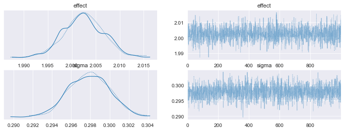
Histograms and Trace Plots for our Priors, matching the form of our synthetic data. Image generated by the author.
Our final validation step checks the posterior distributions of our Delta and sigma variables. We expect our az.plot_posterior function to return the estimates of our treatment effect and variance terms (which we specified in our data generation function). Because our estimated and ‘real’ terms fall within the 95% confidence interval, we can evaluate the sign and magnitude of our treatment effect.
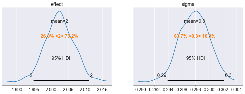
Recovered posteriors of our model’s Treatment Effect and Variance terms. Image generated by the author.
With all three plots, we can assess whether our Bayesian model satisfies internal validity conditions (normality of errors, etc.) needed for linear regression. Our work does not stop here, however, in the event that our dataset contains additional independent variables.
For higher dimensional datasets, we must make sure that other internal threats to our model are not present. We need to check (in addition to our prior/posterior validity) whether:
Other continuous variables paired with our outcome variable do not exhibit sharp discontinuities AND
Observations proximate to the eligibility threshold are not sorting across the cutoff
In Part I, I describe a few procedures we employ to check conditions one and two. These procedures use plotting techniques that do not require PyMC. To briefly recap:
I refrain from conducting additional internal validity tests, mainly because you and I know the data generating process underlying our analysis.
I also refrain from considering external factors that may affect the significance and generalizability of our model. I sound like a broken record at this point, but Part I covers considerations governing external model threats. Generally, external forces are dependent on an experiment’s subject matter/hypothesis. Practitioners should use their subject expertise to justify frameworks which 1) support the use of a specific model (RDD in our case) and 2) negate potential external factors that affect modeling outcomes. Again, I am working from a general example so I do not elaborate on how to reason through external threats.
Go ahead, I dare you, refer to Part I if you’re confused!
Now that we’ve justified the form of our priors and recovered their respective stationary distributions, we can assess the effects of our model.
For the sake of clarity, I include the regression_discontinuity_plot function for reference. In order to generate the linear regressions in our plot, we create a vector of 500 linearly spaced running variable values and a vector of zeroes (in this case of length 500). We then use our mod and InferenceData objects to sample from the posterior distributions of our treated and untreated data. Once we fill the vector of 0s with a sampled posterior target value y , we generate our model intercept mu and plot our regression (this is done twice to generate control and treatment regression).
def regression_discontinuity_plot(
    data, eligibility_threshold, bandwidth, trained_mod, inf_data
    ):

    # Seaborn bc it's nicer to look at
    sns.set_style("darkgrid")

    ### UNTREATED OBSERVATIONS

    # Instantiate data for future sampling
    mu_x = np.linspace(np.min(data.X), np.max(data.X), 500)
    lab_treated = np.zeros(mu_x.shape)

    # Use aliases found in model.py file for lines
    with trained_mod:
        pm.set_data({"x_vals": mu_x, "treated_obs": lab_treated})
        ppc = pm.sample_posterior_predictive(inf_data, var_names=["mu", "y"])

    # Scatterplot for treatment,control,eligibility threshold
    ax = data_scatterplot(data, eligibility_threshold)

    # Plot control group's regression line, labels for mu
    az.plot_hdi(
        mu_x,
        ppc.posterior_predictive["mu"],
        color="C1",
        hdi_prob=0.95,
        ax=ax,
        fill_kwargs={"label": r"$\mu$ untreated (Counterfactual)"})


    ### TREATED OBSERVATIONS

    # Instantiate data for future sampling
    mu_x = np.linspace(np.min(data.X), np.max(data.X), 500)
    lab_treated = np.ones(mu_x.shape)

    # Use aliases found in model.py file
    with trained_mod:
        pm.set_data({"x_vals": mu_x, "treated_obs": lab_treated})
        ppc = pm.sample_posterior_predictive(inf_data, var_names=["mu", "y"])

    # Plot treatment's regression line, labels for mu
    az.plot_hdi(
        mu_x,
        ppc.posterior_predictive["mu"],
        color="C0",
        hdi_prob=0.95,
        ax=ax,
        fill_kwargs={"label": r"$\mu$ treated (Actual Trend)"})


    plt.legend()
    plt.show()

regression_discontinuity_plot(df, ELIGIBILITY_THRESHOLD, mod, inference_data)
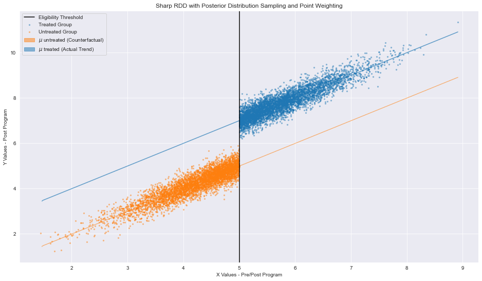
Regression Discontinuity Plot with linear regressions generated from sampling our Bayesian model’s posterior distribution. Image generated by the author
The regressions serve as proxies for two scenarios: one where all observations are treated and one where no observations are treated.
Let’s return to the intuition behind regression discontinuity designs (cough, Part I for more, cough). We deduce a causal relationships based on the belief that, if no program was enacted, the slope of our untreated observations (in orange) would remain constant. In other words, ceteris paribus, our policy is the sole determinant of our effect. This however, is an unrealized scenario based on the actual distribution of our data (pre/post policy discrepancies). The converse of this scenario (one where all observations are treated) would also result in a constant sloping line. In our case, the situation is also unrealized. We leverage our fixed slopes assumptions to difference the regressions at the eligibility threshold. Bing, bang, boom, we now have a quantifiable effect (for observations those around cutoff) proving that policy X affects a certain population by magnitude TE.
Nice, we’ve validated our underlying assumptions, assessed the implications of our counterfactuals, and deduced the size of our treatment effect! What’s left is not up to the designer of the experiment. Now that we’ve implemented a policy and tabulated some results, what can we take away? What decisions can we make now that we know a specific behavior influences our population? Again, these questions are entirely dependent on the data and tested hypothesis. For now, however, it seems like we’ve worked through the specifics of model building and justifications for model designs.
Okay so, it would be remiss to not acknowledge that this is a long post. The truth is that we are really just getting started, hence why there will be a Part III focusing on Ploomber pipelines.
There are many ways that we can make this analysis more nuanced - I’ve mentioned a few previously when discussing likelihood-based treatment assignment and polynomial regressions. With additional nuance comes increasing computational complexity. It may be a larger dataset, it may be a more complex Bayesian model - either way, we need to scale our computations and then run our models with ease. As a beginner to probabilistic programing languages, it was a nightmare building this very simple model out.
Enter: Ploomber (if you are so kind, do give us a star on GitHub). Here’s my pitch: Ploomber allows us to seamlessly manage and deploy our Bayesian models. Everyone knows it’s a pain in the behind to refactor models at a production level, especially when you need to run time-sensitive analyses for a variety of scenarios/hyperparameters. In Part III, I’ll show you how to do that efficiently. Before we work with Ploomber for speedy pipeline orchestration, however, allow me to motivate Part III with some more theory.
Let’s take a step back and talk about eligibility thresholds and running variables. I have frequently used the term arbitrary to describe our eligibility threshold. You may be asking yourself, “what does this imply?”. Ideally, when we select a point on our running variable to divide clearly observable treatment and control groups, we can do so anywhere. It should not matter where we select this division, as long as we are able to validate and measure the differences between the groups proximate to the threshold.
The main intuiting behind measuring treatment effects comes from an important assumption in Economics. Intuitively, points that have similar running variables values tend to share:
similar outcome values (usually, with some amount of unexplained error) AND
similar characteristics unaccounted for in our dataset
To illustrate, consider a theoretical plot measuring lifetime earnings potential based on one’s education (measured via years of schooling). Based on the assumptions above, we could plot earnings at variable levels of schooling and say that:
people with similar levels of schooling tend to report similar earnings levels AND
there is a high likelihood that people with similar levels of schooling share unmentioned/unaccounted socioeconomic factors (say: a parent’s highest level of education or an individual’s level of employment)
Observations around the eligibility threshold, most likely, share defined and undefined characteristics. It is the case then that the discontinuity between similar values is only a direct result of our policy. Because the observations around the eligibility threshold share similar characteristics, then we can assume that they are as good as randomized (they just so happen to have RV values that are slightly different). With this knowledge, we can conduct inference and suggest future policy changes.
This begs the question: how should we evaluate points that are far (relative to the value of their running variable) from one another? How do you compare these observations? Why should distant observations contribute equally to treatment effect of our model if they have dissimilar unknown factors?
Proximity considerations seem to contradict the underlying interpretability of our model, but there is a potential solution that we can implement. Enter: kernel weighting. The premise is simple - we select an interval around our running variable’s eligibility threshold (a bandwidth) to determine the ‘contribution’ of specific observations within our model. Specifically, we weight the individual effects contributed by each point based on the following criteria:
In effect, we can determine changes within our treatment effect based on a subset of our complete data. We also satisfy the assumption that our arbitrary cutoff does not impact the expressed/unexpressed similarities of our data. We calculate an individual’s weight w as follows:
Where x is our vector of observation i, t is our eligibility threshold, and b is our bandwidth distance.
As you can imagine, we will use Ploomber in conjunction with bandwidth weighing to test the effectiveness of our Bayesian regression discontinuity model. Specifically, we will build out our model, attach weights from different bandwidths, and evaluate the tradeoffs between model validity/explainability at these bandwidths. The good news, we can accomplish this in typical data scientist workflow without having to heavily modify our current modeling pipeline! The bad news, you’ll have to stick around and wait until then.
Seamless deployment for data scientists and developers. Ploomber handles infrastructure so you focus on building. Secure and scalable—from personal projects to enterprise apps. Support for Streamlit, Dash, Docker, and AI-powered applications. Because life's too short for deployment headaches.