


Dash, developed by Plotly, is a powerful framework for building interactive web applications using only Python. It’s a perfect tool for those who prefer to stay within the Python ecosystem while developing applications that not only visualize data but also interact dynamically with it.
For those who are new to Dash, here’s a brief overview of how it works. Dash apps are built using two primary constructs: the layout and the callbacks. The layout defines the appearance of the app and is constructed using various components such as dropdowns, buttons, and graphs. The magic happens with callbacks, which are Python functions that Dash automatically invokes in response to user interactions. These features make the application highly responsive, enabling real-time interactions without needing to refresh the page.
The default aesthetics provided by Dash might suffice for quick projects or prototypes. However, for a production-grade application, customization is key. It improves both the application’s usability and its engagement levels. Here’s why tweaking the UI is crucial:
In this blog post, we’ll explore how to customize the Dash UI to meet specific aesthetic and functional needs, ensuring your applications are not only functional but also visually appealing and user-friendly.
This is the simplest way to customize the appearance of Dash components. You can directly add CSS styles to components through the style attribute. This method is quick and easy for small changes like adjusting padding, margins, colors, or fonts.
# app_inline.py
from dash import html, Dash

app = Dash(__name__)
server = app.server

app.layout = html.Div([
    html.H1(
        'Welcome to Dash Customization Demo!',
        style={'textAlign': 'center'}
    ),
    html.Button(
        'Click me!',
        style={
            'width': '100%',
            'padding': '10px',
            'background': 'darkgreen',
            'color': 'white',
            'fontSize': '16px'
        }
    )
], style={'padding': '20px'})

if __name__ == '__main__':
    app.run_server(debug=True)
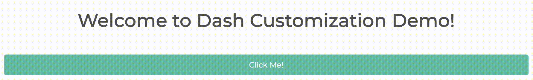
Simply run python app_inline.py, and you’ll see your Dash app as shown below.

This method is straightforward and keeps style changes localized to specific components, but it can become cumbersome for larger applications or more extensive styling changes.
For larger-scale projects, storing your CSS files in the assets/ folder of your Dash application is highly efficient. Dash automatically recognizes and applies any CSS or JavaScript files placed in this folder, making it the easiest method to integrate your styles.
Your project structure should include an assets/ folder containing a style.css file.
/* assets/style.css */
.button {
  width: 100%;
  padding: 10px;
  color: white;
  font-size: 16px;
}

.green {
  background: darkgreen;
}

.blue {
  background: blue;
}

.red {
  background: red;
}

.center-text {
  text-align: center;
}

.padding-20 {
  padding: 20px;
}
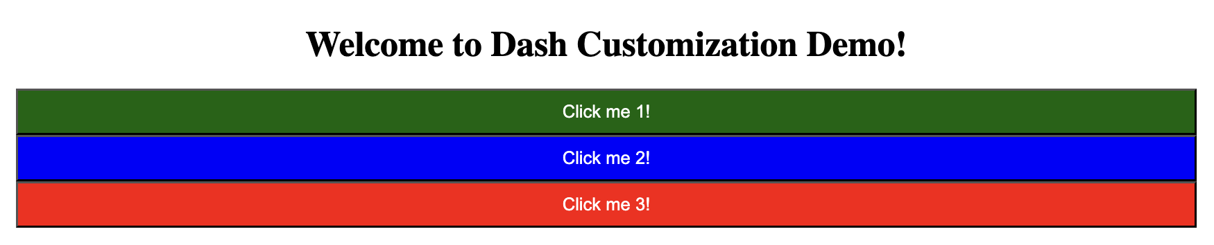
# app_css.py
from dash import html, Dash

app = Dash(__name__)
server = app.server

app.layout = html.Div([
    html.H1(
        'Welcome to Dash Customization Demo!',
        className='center-text'
    ),
    html.Button('Click me 1!', className='button green'),
    html.Button('Click me 2!', className='button blue'),
    html.Button('Click me 3!', className='button red')
], className='padding-20')

if __name__ == '__main__':
    app.run_server(debug=True)
This way, we can create a Dash app that is more complex than our first example, yet more concise and maintainable compared to using inline styling.
For more information about adding CSS or JavaScript, refer to the official documentation.
For more extensive styling needs, integrating Dash with Bootstrap through the Dash Bootstrap Components library can be extremely effective. It provides ready-to-use components styled with Bootstrap, making your app look professional with minimal effort.
First, install the necessary library using the following command:
pip install dash-bootstrap-components
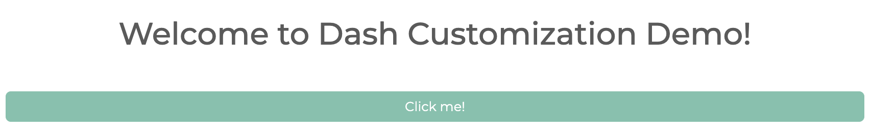
Dash Bootstrap Components do not include CSS by default, which allows users to select any Bootstrap v5 stylesheet to suit their needs. In the example below, we use the MINTY theme. You can explore other available themes here.
# app_bootstrap.py
from dash import Dash, html
import dash_bootstrap_components as dbc

app = Dash(__name__, external_stylesheets=[dbc.themes.MINTY])
server = app.server
With CSS linked, you can start building your app’s layout with the Bootstrap components. See the component documentation for a full list of available components and example usage.
app.layout = dbc.Container([
    dbc.Row(dbc.Col(html.H1("Welcome to Dash!", className="text-center my-4"), width=12)),
    dbc.Row(dbc.Col(dbc.Button("Click me!", color="primary", className="w-100 mt-4 mb-4"), width=12))
], fluid=True)

if __name__ == '__main__':
    app.run_server(debug=True)
Run your Dash app with python app_bootstrap.py. Now, you’ll be able to see the app styled with the Minty theme.
Dash allows you to dynamically update the styling of components using callbacks. This method is useful when the style needs to change in response to user interaction.
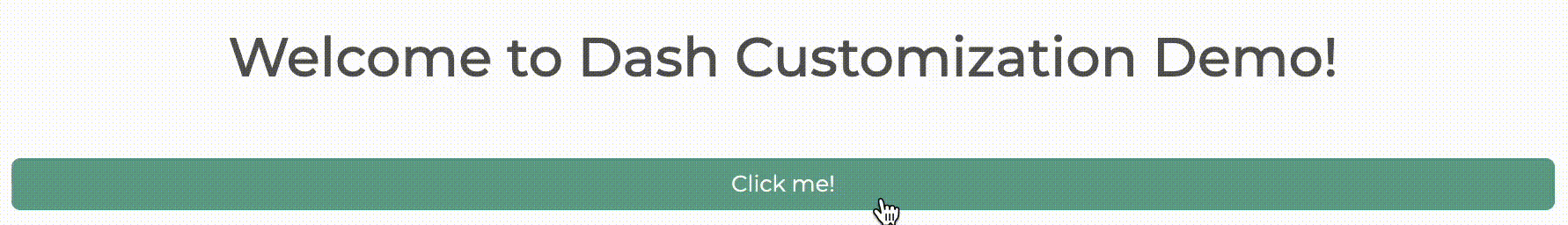
Building on the Minty-themed Dash app we developed in Section 3, let’s enhance its interactivity by making the button’s color change dynamically each time it is clicked. To do this, modify the line where we define the button by adding id and n_clicks attributes as follows:
# app_callback.py
from dash import Dash, html, Input, Output
import dash_bootstrap_components as dbc

app = Dash(__name__, external_stylesheets=[dbc.themes.MINTY])
server = app.server

app.layout = dbc.Container([
    dbc.Row(dbc.Col(html.H1('Welcome to Dash Customization Demo!', className='text-center my-4'), width=12)),
    dbc.Row(dbc.Col(dbc.Button('Click me!', id='btn', n_clicks=0, color='primary', className='w-100 mt-4 mb-4'), width=12))
], fluid=True)
Then, add a simple callback function to dynamically change the button’s color.
@app.callback(Output('btn', 'color'), Input('btn', 'n_clicks'))
def update_style(n_clicks):
    colors = ['primary', 'secondary', 'warning']
    return colors[n_clicks % 3]
Using the callback function above, you’ll now see your button’s color change, rotating through three colors each time the button is clicked. To learn more about the various predefined color options available, refer to the Dash Bootstrap Documentation.
To achieve advanced functionality and customization beyond what standard HTML and CSS can offer, you can create custom Dash components using the Dash Component Boilerplate. This approach allows for deep integration of custom behaviors and complex interactions.
In the following example, we will develop a custom button component featuring a bounce animation. This demonstrates how to leverage React.js within the Dash framework to add dynamic and engaging elements to your applications.
First, ensure that Node.js and npm are installed on your system. Download and install them from the Node.js official website as npm comes bundled with Node.js installations.
Then, install the following libraries in your terminal:
pip install cookiecutter
pip install virtualenv
Next, run cookiecutter on the dash-component-boilerplate repository to streamline the setup process:
cookiecutter gh:plotly/dash-component-boilerplate
Follow the prompts to specify details about your new project, such as component name, description, and author information. This will create a new Dash component project complete with a predefined template, including all necessary directory structures and files. Below is an example output of running the command above:
(base) ➜ cookiecutter gh:plotly/dash-component-boilerplate
[1/14] project_name (my dash component): demo
[2/14] project_shortname (demo):
[3/14] component_name (Demo): CustomButton
[4/14] jl_prefix ():
[5/14] r_prefix ():
[6/14] author_name (Enter your first and last name (For package.json)): <your name>
[7/14] author_email (Enter your email (For package.json)): <your email>
[8/14] github_org ():
[9/14] description (Project Description): A simple custom button component created for the Dash UI customization demo.
[10/14] Select use_async
1 - False
2 - True
Choose from [1/2] (1):
[11/14] Select component_type
1 - Function Component
2 - Class Component
Choose from [1/2] (1):
[12/14] Select license
1 - MIT License
2 - BSD License
3 - ISC License
4 - Apache Software License 2.0
5 - GNU General Public License v3
6 - Not open source
Choose from [1/2/3/4/5/6] (1):
[13/14] publish_on_npm [y/n] (y):
[14/14] install_dependencies [y/n] (y):
Navigate into the newly created project directory. While the folder structure may initially seem overwhelming, we’ll concentrate on two main scripts that are essential for custom component integration:
usage.py for your Dash application
src/lib/components/<component_name>.react.js for your custom React component
Let’s adapt our Dash app from Section 3 to include our custom button that bounces once clicked. The app_bootstrap.py code defines the button component as follows:
dbc.Row(
    dbc.Col(
        dbc.Button(
            'Click me!',
            color='primary',
            className='w-100 mt-4 mb-4'
        ),
        width=12
    )
)
For our custom component, we will extract properties such as the component’s id, label, color, and className from the Dash app and add a bouncing effect upon a click event. This is done in the src/lib/components/CustomButton.react.js.
// src/lib/components/CustomButton.react.js
import React, { useState } from 'react';
import PropTypes from 'prop-types';

/**
 * CustomButton is an example component that shows a bouncing button.
 */
const CustomButton = (props) => {
    // Extract the props
    const { id, label, color, className } = props;
    const [isBouncing, setIsBouncing] = useState(false);

    // Handle the button click event
    const handleClick = () => {
        setIsBouncing(true);
        setTimeout(() => setIsBouncing(false), 500);  // Reset after animation
    };

    // Determine Bootstrap color class based on the color prop
    const colorClass = color ? `btn-${color}` : '';

    // Render the button
    return (
        <button
            id={id}
            onClick={handleClick}
            className={`btn ${colorClass} ${className} ${isBouncing ? 'bouncing' : ''}`}
            style={{
                padding: '10px 20px',
                border: 'none',
                borderRadius: '5px',
                backgroundColor: color ? '' : '#ff8c00',  // Custom fallback color if no Bootstrap color is provided
                color: 'white',
                fontSize: '16px',
                cursor: 'pointer',
                outline: 'none',
                position: 'relative',
                transition: 'transform 0.3s ease',
                transform: isBouncing ? 'translateY(-10px)' : 'translateY(0)',
            }}
        >
            {label}
        </button>
    );
}

CustomButton.propTypes = {
    /**
     * The ID used to identify this component in Dash callbacks.
     */
    id: PropTypes.string,

    /**
     * A label that will be printed when this component is rendered.
     */
    label: PropTypes.string.isRequired,

    /**
     * The color of the button.
     * This should be a Bootstrap color name.
     */
    color: PropTypes.string,

    /**
     * The className of the button.
     * This is used to apply custom styles to the button.
     */
    className: PropTypes.string,
};

export default CustomButton;
Once the component is ready, compile it with:
npm run build
This command generates the necessary JavaScript and Python files that comprise your custom Dash component, configured based on your specifications.
Now it’s time to integrate your newly created custom component into your Dash app. Update the usage.py script by adapting the structure from app_bootstrap.py, replacing the standard button with the custom one we developed earlier, CustomButton.
# usage.py
from demo import CustomButton
from dash import Dash, html
import dash_bootstrap_components as dbc

app = Dash(__name__, external_stylesheets=[dbc.themes.MINTY])
server = app.server

# Define the layout of the app using Bootstrap components
app.layout = dbc.Container([
    dbc.Row(dbc.Col(html.H1('Welcome to Dash Customization Demo!', className='text-center my-4'), width=12)),
    dbc.Row(dbc.Col(
        CustomButton(id='custom-button', label='Click Me!', color='primary', className='btn btn-primary w-100 mt-4 mb-4'), width=12))
], fluid=True)


if __name__ == '__main__':
    app.run_server(debug=True)
Run python usage.py to see your custom button in action. The button will display a bouncing effect each time it is clicked.
By following these steps, you’ve successfully enhanced your Dash application with a unique, interactive custom component, adding both functionality and aesthetic appeal.
This guide has walked you through various methods for customizing your Dash app. Now, let’s take a quick look at how you can easily deploy your Dash app on Ploomber Cloud. Deploying your Dash application on Ploomber Cloud is straightforward and ensures your app can be accessed by users anytime, anywhere. Ploomber Cloud not only provides deployment solutions but also robust security features, including password protection and application secrets. If you haven’t created an account yet, start for free here and deploy your app today!
Ploomber Cloud supports two deployment methods:
To deploy your Dash app on Ploomber Cloud, you need:
app.pyrequirements.txtYou should ensure your Dash app script is called app.py. If you’ve followed along the tutorial, you will have multiple Dash scripts. Rename the one you want to deploy to app.py. Also, your requirements.txt should be:
dash
dash-bootstrap-components
Note: If you’re deploying the last example that includes a custom component, ensure you also include the auto-generated scripts required for proper functionality:
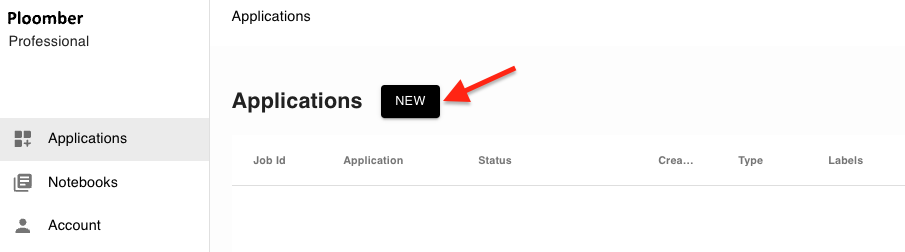
<project_shortname>/__init__.py<project_shortname>/_imports_.py<project_shortname>/<component_name>.py<project_shortname>/<project_shortname>.min.js<project_shortname>/<project_shortname>.min.js.map<project_shortname>/package-info.jsonLog into your Ploomber Cloud account.
Click the NEW button to start the deployment process:
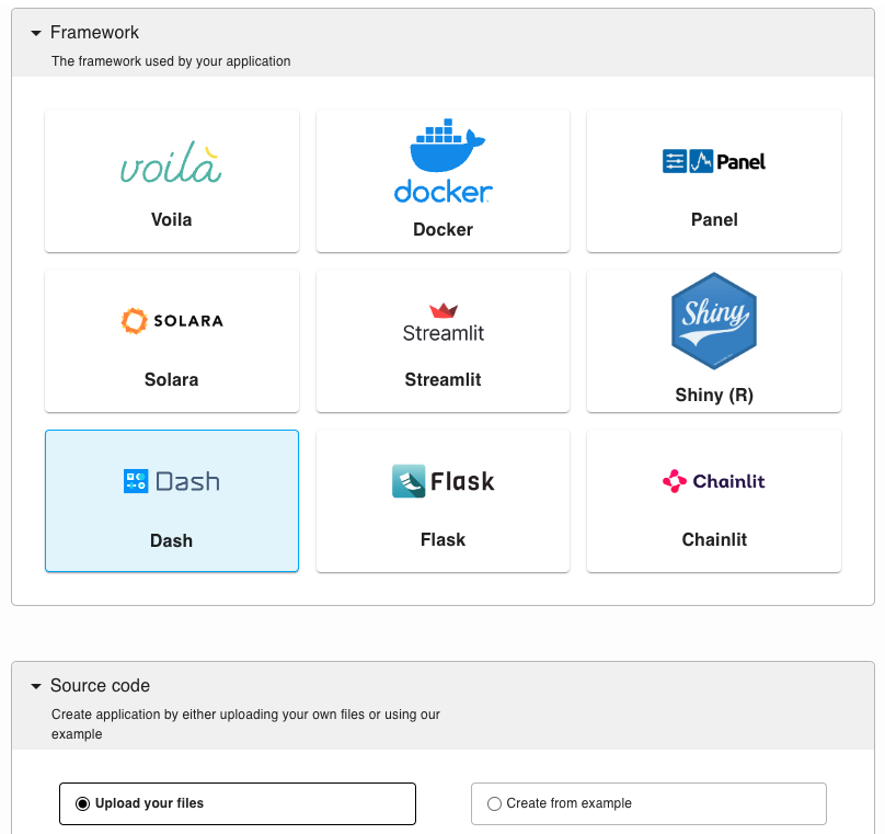
Select the Dash option, and upload your code (app.py and requirements.txt) as a zip file in the source code section:
After optionally customizing some settings, click CREATE.
If you haven’t installed ploomber-cloud, run:
pip install ploomber-cloud
Set your API key following this documentation.
ploomber-cloud key YOURKEY
Navigate to your project directory where your files are located:
cd <project-name>
Or, if you prefer downloading the explained code and make changes there, run the following command:
ploomber-cloud examples dash/dash-customization
Then, initialize the project and confirm the inferred project type (Dash) when prompted:
(testing_dash_app) ➜ ploomber-cloud init                    ✭ ✱
Initializing new project...
Inferred project type: 'dash'
Is this correct? [y/N]: y
Your app '<id>' has been configured successfully!
To configure resources for this project, run 'ploomber-cloud resources' or to deploy with default configurations, run 'ploomber-cloud deploy'
Deploy your application and monitor the deployment at the provided URL:
(testing_dash_app) ➜  cloud ploomber-cloud deploy                  ✭ ✱
Compressing app...
Adding app.py...
Ignoring file: ploomber-cloud.json
Adding requirements.txt...
App compressed successfully!
Deploying project with id: <id>...
The deployment process started! Track its status at: https://www.platform.ploomber.io/applications/<id>/<job_id>
For more details, refer to this documentation.
Dash provides various methods for customizing your application’s UI, from simple inline CSS styling to fully custom components, ensuring that you can tailor your app to meet specific needs and enhance user engagement. By exploring these options, you can craft a user interface that not only looks great but also feels intuitive and responsive to your users.
Seamless deployment for data scientists and developers. Ploomber handles infrastructure so you focus on building. Secure and scalable—from personal projects to enterprise apps. Support for Streamlit, Dash, Docker, and AI-powered applications. Because life's too short for deployment headaches.