


Machine learning has become an essential tool in many fields, including healthcare, finance, insurance, retail and bioinformatics. In these domains, the performance of a machine learning model can have significant real-world consequences, making it important to carefully evaluate and improve these models. One effective way to do this is through the use of evaluation plots.
There are several types of plots that can be used to evaluate the performance of a machine learning model. Some common ones include:
TLDR: A confusion matrix shows the number of true positive, true negative, false positive, and false negative predictions made by the model.
A confusion matrix is a table that is often used to describe the performance of a classification model on a set of data for which the true values are known. In a confusion matrix, the rows represent the actual values and the columns represent the predicted values. It typically has four entries: true positives (TP), false positives (FP), true negatives (TN), and false negatives (FN). A good confusion matrix will have a large number of correct predictions, where the predicted values match the true values. This is indicated by a large number of true positives (TP) (cases where the model predicted the positive class and the true value was also positive) and true negatives (cases where the model predicted the negative class and the true value was also negative).
For example, if you have a binary classification model that is trying to predict whether an email is spam or not spam, a confusion matrix can help you see how many emails the model is correctly classifying as spam and how many it is misclassifying. This can be useful for identifying areas where your model may need to be improved.
Code snippets for confusion matrices
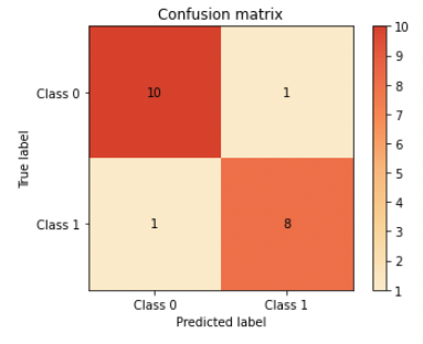
In this confusion matrix, the model has a high number of correct predictions, with 8 true positives, 10 true negatives, 1 false positives, and 1 false negatives.
A bad confusion matrix, on the other hand, will have a large number of incorrect predictions. This is indicated by a large number of false positives (cases where the model predicted the positive class but the true value was negative) and false negatives (cases where the model predicted the negative class but the true value was positive).
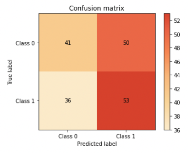
In this confusion matrix, the model has a low number of correct predictions, with 53 true positives, 41 true negatives, 36 false positives, and 50 false negatives.
This can help you understand where the model is making mistakes and identify potential issues with class imbalance. If there is class imbalance in yout dataset (i.e., one class is significantly more prevalent than the other), this can affect the overall performance of your model. For example, if class 0 is much more prevalent than class 1, the model may simply predict class 0 for all instances, leading to a high accuracy but poor performance on class 1.
By examining the confusion matrix, you can identify whether class imbalance is causing poor performance on one of the classes. For example, if the model is consistently predicting class 0 but getting a high number of false negatives (FN) for class 1, this could indicate that the model is struggling to identify instances of class 1 due to class imbalance (we can see in the matrix above this happens more often than FP).
TLDR: A ROC curve, which shows the trade-off between the true positive rate and the false positive rate.
A receiver operating characteristic (ROC) curve is a plot that shows the performance of a binary classification model at all classification thresholds.
The x-axis of the plot represents the false positive rate (FPR), and the y-axis represents the true positive rate (TPR). The classification threshold can be adjusted to achieve different trade-offs between TPR and FPR. For example, in the example plots below we’ve used a threshold of 0.1 for the good example and 0.5 for the bad one, which resulted in lesser model performance.
The ROC curve is useful for evaluating machine learning models because it provides a way to visualize the trade-off between the true positive rate and false positive rate. This can help you understand how the model is performing and identify the optimal classification threshold for your model: For example, a model with a high true positive rate and low false positive rate will be more accurate, but it may also be less sensitive to positive instances. In case our model is predicting if a customer will churn, our certainty of a customer churn goes up, but as a tradeoff we’re filtering out some of the ones that churn. On the other hand, a model with a lower true positive rate but a higher false positive rate will be less accurate, but it may be more sensitive to positive instances. On the same note of customer churn, we’ll overall be less accurate but will capture more of those who will actually churn (and some that won’t along the way - which decreases our accuracy). By comparing different ROC curves, you can determine which model is best suited for your particular problem. You can read more about optimizing your threshold in our latest blog.
Code snippet for ROC curve plots
Here are some examples of good and bad ROC curves:
A good ROC curve will be close to the upper left corner of the plot, indicating that the model is capable of distinguishing between the positive and negative classes well (high TPR).
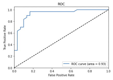
In this ROC curve, the model has a high true positive rate and a low false positive rate. This indicates that the model is capable of distinguishing between the positive and negative classes well.
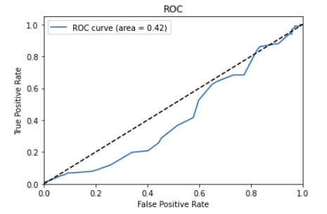
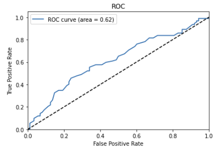
In these two ROC curve, the model has a low true positive rate and a high false positive rate (the exact opposite of what we’re looking for). In the first plot we can even see it’s biased towards false positive. This indicates that the model is not capable of distinguishing between the positive and negative classes well (pretty much making it useless, like flipping a coin).
ROC curve can be useful for evaluating binary classification models and choosing a threshold for making predictions.
TLDR: A precision-recall curve shows the relationship between the precision and recall of a model. This can be useful for evaluating models that have imbalanced classes or are being used to make hard decisions (for instance if our patient might have cancer).
A precision-recall curve is a plot that shows the performance of a binary classifier as its discrimination threshold is varied. The precision-recall curve is created by plotting the precision on the y-axis against the recall on the x-axis.
Precision is the number of true positives divided by the total number of positive predictions. Recall is the number of true positives divided by the total number of actual positive instances. A good precision-recall curve will have a high precision and a high recall. This indicates that the classifier is able to correctly identify a large number of positive instances, while also having a low number of false positives.
Continuing our previous example on a model that predicts customer churn:
Code snippet for PR curve plots
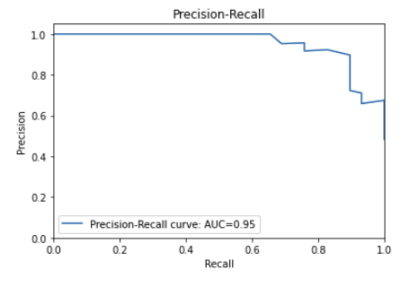 In this precision-recall curve, the precision is high and the recall is high.
This indicates that the classifier is performing well.
In this precision-recall curve, the precision is high and the recall is high.
This indicates that the classifier is performing well.
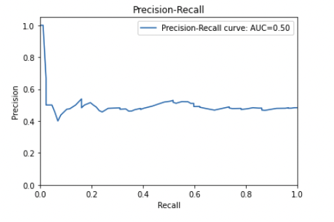 In this precision-recall curve, the precision is low and the recall is low (exact inverse of the one above).
This indicates that the classifier is not performing well.
In this precision-recall curve, the precision is low and the recall is low (exact inverse of the one above).
This indicates that the classifier is not performing well.
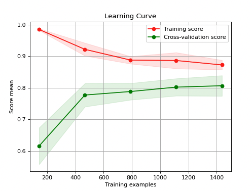
TLDR: A learning curve shows the performance of a model on training and validation data as the amount of data used to train the model increases. Indicates if the model is suffering from overfitting or underfitting.
A learning curve is a plot that shows the performance of a machine learning model as the training set grows. The x-axis of the plot represents the training set size, and the y-axis represents the performance of the model, typically measured using a metric such as accuracy (classification) or mean squared error/MSRE (regression).
Typically, the learning curve starts with a steep slope, indicating that the model is able to learn quickly and make accurate predictions with a small amount of training data. As the amount of training data increases, the slope of the learning curve becomes less steep, indicating that the model’s performance is improving more slowly. Eventually, the learning curve levels off, indicating that the model has reached its maximum performance and adding more training data will not improve its accuracy.
In many real-world cases, collecting data is expensive. Using a learning curve can help you decide if it’s worth collecting more training data, or if adding more data won’t benefit the model performance.
Code snippet for learning curve plots
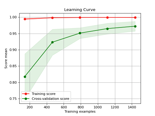
In this learning curve, the model’s performance improves as the training set size increases. This indicates that the model is able to learn from the data and make better predictions.
In this learning curve, the model’s performance does not improve (even deteriorates which can lead to severe issues - see below) as the training set size increases. This indicates that the model is not able to learn from the data and make better predictions.
** Performance deterioration is serious issue!** When this happens it is a hint that there might be some data corruption/data quality issues and it’s worth investigating. Usually the performance just stalls but doesn’t deteriorate. To prevent/mitigate model performance deterioration, it is important to regularly evaluate the model’s performance and re-train or update the model as needed. In addition, it is important to monitor for data drift and ensure that the model is not overfitting the training data.
TLDR: A calibration curve shows the predicted probabilities of a model compared to the actual probabilities. This can help you understand whether the model is well-calibrated.
A calibration curve is a plot that shows the relationship between the predicted probabilities and the true positive rate. The x-axis of the plot represents the predicted probabilities, and the y-axis represents the true positive rate.
A good calibration curve will be close to the line y=x, which indicates that the predicted probabilities are accurate. This means that if a classifier predicts that a given instance has a 70% probability of belonging to the positive class, then about 70% of instances with predicted probabilities of 70% will actually belong to the positive class.
A code snippet for calibration curve
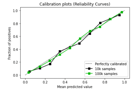
In this calibration curve, the curve is close to the line y=x. This indicates that the predicted probabilities are accurate.
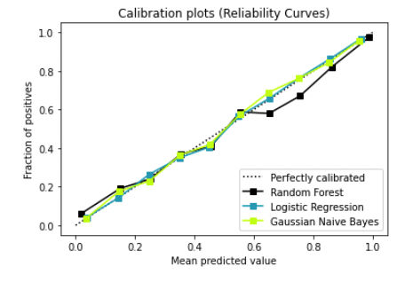
In the above plot we can see another great example, this time plotting the different model curves. We can see logistic regression is outperforming the Random Forest as it’s almost identical to the y=x line (perfect calibration).
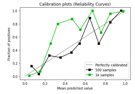
In this calibration curve, the curve is very far from the line y=x. This indicates that the predicted probabilities are not accurate. We can see that a lower sample size (500 in our case) is even further from the y=x line and definitely isn’t optimal.
It’s important to remember that the choice of evaluation plots will depend on the specific task and type of machine learning model being used, so it’s always a good idea to do some research and choose the plots that are most relevant to your particular situation.
You can easily leverage the sklearn-evaluation open-source package to generate all kinds of plots. This python software makes Machine learning model evaluation easy no matter what you are trying to plot: plots, tables, HTML reports and Jupyter notebook analysis. You can benchmark your model performance and compare it to additional models within the same plots. Go to the documentation to learn more about it.
Overall, evaluation plots are an essential tool for improving the performance of machine learning models in a variety of domains. By carefully analyzing these plots, data scientists and machine learning practitioners can identify potential areas for improvement and optimize their models to deliver the most accurate and reliable results. Plotting allows practitioners to benchmark performance and comparing results to get the best predictions from their data. It allows a common language within data science teams and an easy mechanism to get insights from the data.
Seamless deployment for data scientists and developers. Ploomber handles infrastructure so you focus on building. Secure and scalable—from personal projects to enterprise apps. Support for Streamlit, Dash, Docker, and AI-powered applications. Because life's too short for deployment headaches.