


Comparing models is one of the essential steps in the Machine Learning workflow: we fit models with different parameters, features, or pre-processors and need to decide which is the best. However best is highly dependent on the problem. In industry, practitioners often use a few plots to benchmark models.
There are many standard plots to evaluate Machine Learning classifiers: confusion matrix, ROC curve, precision-recall curve, among others. They all visually present vital characteristics of our model, and they’re a more robust way to evaluate a model than using a numerical metric alone.
Although these plots are widely used in industry, the tooling around them is limited. Case in point: scikit-learn has a function to compute the statistics for a confusion matrix that’s been around for a while, but only recently, a function to generate a plot from such statistics became available (although the documentation had a snippet that you could use to create the chart).
Furthermore, experiment trackers also have limited support for generating comparisons of these plots: it’s been >=2.5 years since someone opened this Mlflow issue asking for a feature to compare figures logged from experiments. Or this other issue, where a user asked the best way to log a confusion matrix.
In this blog post, I’ll share my thoughts on improving visualizations to evaluate Machine Learning models and demonstrate how experiment trackers can enhance their support of evaluation plots.
Let’s begin with a basic example. scikit-learn recently introduced a plotting API. Let’s see how we can use it to compare two classifiers.
First, let’s fit the models:
from sklearn import datasets
from sklearn.model_selection import train_test_split
from sklearn.ensemble import RandomForestClassifier, AdaBoostClassifier
from sklearn.metrics import ConfusionMatrixDisplay
import matplotlib.pyplot as plt

X, y = datasets.make_classification(200, 10, n_informative=5, class_sep=0.65, random_state=0)
X_train, X_test, y_train, y_test = train_test_split(X, y, test_size=0.3, random_state=0)

rf = RandomForestClassifier(random_state=0).fit(X_train, y_train)
rf_y_pred = rf.predict(X_test)


ab = AdaBoostClassifier(random_state=0).fit(X_train, y_train)
ab_y_pred = ab.predict(X_test)
Now, we use matplotlib and ConfusionMatrixDisplay to plot the matrices side by side:
fig, (ax1, ax2) = plt.subplots(ncols=2)
ConfusionMatrixDisplay.from_predictions(y_test, rf_y_pred, ax=ax1)
ConfusionMatrixDisplay.from_predictions(y_test, ab_y_pred, ax=ax2)
fig.tight_layout()
Console output (1/1):
With a few lines of code, we created the confusion matrices. That’s great! However, there is one significant limitation: the plots are hard to compare.
Since we generated the confusion matrices independently, they have different scales. Having different scales defeats the purpose of using visuals since the colors aren’t meaningful. Let’s improve this.
Let’s now use sklearn-evaluation to generate comparable confusion matrices. Let’s re-use the predictions we created in the previous section:
import matplotlib.pyplot as plt
from sklearn_evaluation import plot

rf_cm = plot.ConfusionMatrix.from_raw_data(y_test, rf_y_pred)
ab_cm = plot.ConfusionMatrix.from_raw_data(y_test, ab_y_pred)
We can display the first confusion matrix individually:
rf_cm
Console output (1/1):

The second one:
ab_cm
Console output (1/1):

And combine them with the + operator:
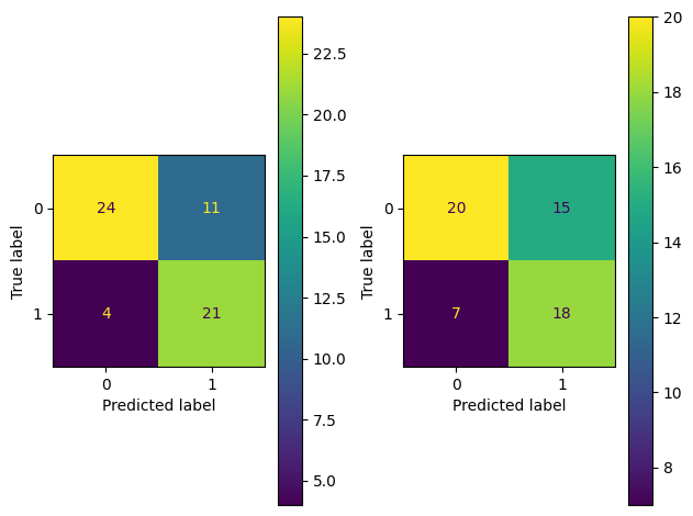
rf_cm + ab_cm
Console output (1/1):

This combined plot makes it easy to compare the two models since they’re on the same scale. We can quickly see that performance between the two models is similar. However, the RandomForest is slightly better since it’s getting more Class 0 and Class 1 examples correct than the AdaBoost (24 vs. 20 and 21 vs. 18).
Alternatively, we can directly answer the question How better is the RandomForest model than the AdaBoost? by using the - operator:
rf_cm - ab_cm
Console output (1/1):

We can quickly see the differences here. The RandomForest model is getting four more examples right in Class 0 and three more in Class 1.
Using the arithmetic operators (+, and -) is a convenient way to generate combined plots. Let’s see how to extend this to other evaluation plots.
One of my favorite tools from scikit-learn is the classification report, which gives you a metrics summary of any classifier:
from sklearn.metrics import classification_report

print(classification_report(y_test, rf_y_pred))
Console output (1/1):
precision    recall  f1-score   support

           0       0.86      0.69      0.76        35
           1       0.66      0.84      0.74        25

    accuracy                           0.75        60
   macro avg       0.76      0.76      0.75        60
weighted avg       0.77      0.75      0.75        60
The table includes each class’s precision, recall, f1-score, and support. Let’s use sklearn-evaluation again to represent this table visually. Let’s generate one for the random forest model:
rf_cr = plot.ClassificationReport.from_raw_data(y_test, rf_y_pred)
rf_cr
Console output (1/1):

And now one for the AdaBoost model:
ab_cr = plot.ClassificationReport.from_raw_data(y_test, ab_y_pred)
ab_cr
Console output (1/1):

Let’s combine them with the + operator:
rf_cr + ab_cr
Console output (1/1):

Since we’re bringing both models to the same scale, we can see that the RandomForest model is performing better at a glance (the upper left triangles have darker colors than the lower right ones). For example, the RandomForest has 0.86 precision in the Class 0, while the AdaBoost model has 0.74.
Let’s compute the differences with the - operator:
rf_cr - ab_cr
Console output (1/1):

Since there are no negative values, we can see that the RandomForest model is better in all metrics. With all differences between 0.11 and 0.12.
We can extend this concept of combined plots to other popular evaluation charts like ROC curve or precision-recall, you get the idea. Let’s move on to the next topic!
Once we go beyond a dozen of experiments, managing them can become a pain. Experiment trackers (e.g., MLflow) allow us to manage thousands of experiments and compare them. Unfortunately, they all have the same issue: when logging a plot, you are logging the image data, losing a lot of flexibility: the image is stored in a fixed resolution, format, color, etc. A better approach is to serialize the statistics needed to generate the plot, so we can later unserialize it and tweak it. But if you want to go this route, you’ll have to find a workaround (see this 3-year-old MLflow issue!). Furthermore, some experiment trackers don’t even support side-by-side plot comparisons (this has been an open issue in MLflow for >2.5 years).
This inflexibility severely limits our ability to compare your Machine Learning experiments. So we added built-in support for the most common plots to our SQL-based experiment tracker. Let’s see how it works!
First, instantiate the tracker:
from pathlib import Path
from sklearn_evaluation import SQLiteTracker

path = Path("experiments.db")

if path.exists():
    path.unlink()

tracker = SQLiteTracker("experiments.db")
Now, let’s record the two experiments we’ve been using (AdaBoost, and RandomForest):
for model, y_pred in ((rf, rf_y_pred), (ab, ab_y_pred)):
    exp = tracker.new_experiment()
    exp.log("model_name", type(model).__name__)
    exp.log_confusion_matrix(y_test, y_pred)
    exp.log_classification_report(y_test, y_pred)
Let’s query our experiments database and render the evaluation plots inline:
table = tracker.query("""
SELECT
    uuid,
    json_extract(parameters, '$.model_name') as model_name,
    json_extract(parameters, '$.classification_report') as classification_report,
    json_extract(parameters, '$.confusion_matrix') as confusion_matrix
    FROM experiments
""", as_frame=False, render_plots=True)

table
Console output (1/1):
| uuid | model_name | classification_report | confusion_matrix |
|---|---|---|---|
| 81dc984a | RandomForestClassifier | | |
| 442d0b79 | AdaBoostClassifier | | |
Once we have a dozen experiments, it’ll be hard to assess the plots in the table view, so let’s zoom in and extract the confusion matrices. The following code produces a tab view, one per experiment:
table.get("confusion_matrix")
Console output (1/1):
We can also retrieve individual experiments by using their IDs:
one = tracker.get('81dc984a')
another = tracker.get('442d0b79')
Let’s get the confusion matrices and combine them:
one['confusion_matrix'] + another['confusion_matrix']
Console output (1/1):
We can do the same with the classification reports:
one['classification_report'] + another['classification_report']
Console output (1/1):
Even though experiment trackers have evolved a lot in the last few years, there’s still a long way to go. We hope this post inspires the community to develop tools that allow more flexible model comparison. A few weeks ago, we published a post on experiment tracking and SQL that generated a great discussion on Hacker News. If you want to try our SQL-based experiment tracker, here’s the documentation. And if you have any questions, feel free to join our community.
pip freeze | grep -E 'scikit|sklearn|matplotlib'
Console output (1/1):
matplotlib==3.6.2
matplotlib-inline==0.1.6
scikit-learn==1.1.3
sklearn-evaluation==0.8.2
Seamless deployment for data scientists and developers. Ploomber handles infrastructure so you focus on building. Secure and scalable—from personal projects to enterprise apps. Support for Streamlit, Dash, Docker, and AI-powered applications. Because life's too short for deployment headaches.