


We often need to perform data analytics on very large datasets using Dash, but the rendering of your figures becomes slower as the datasets grow larger. In this blog, we explore 2 approaches to efficiently render large datasets:
plotly-resampler: an external library that dynamically aggregates time-series data respective to the current figure. This approach helps you downsample your dataset at the cost of losing some details.We will test these approaches using a commercial flight dataset that documents information such as flight departure date/time and delays. This dataset contains up to 3 million flights during the first half of 2006. You can find it here. Scatter plots benefit the most from our approaches, as they often require us to plot every data point, unlike bar charts, histograms, pie charts, etc. Therefore, we will be using them in our examples.
Before using the data, we need to take a few steps to clean it: For simplicity, we will be plotting the date and time of departure vs departure delay, thus in our cleaned dataset, we will only keep the above columns and remove rows where there are null values in these columns. It’s also important to ensure that the date/time column is properly formatted as a Python datetime object to produce a clear and accurate figure. Additionally, sorting the date and time column is necessary for the plot-resampler to function correctly, as it requires time series data to operate. You can find details on the data cleaning process in csv-clean.py, located in the example repository. By running python csv-clean.py flights-3m.csv, you will obtain the cleaned version of the flight data flights-3m-cleaned.csv.
Setting up a virtual environment for development is always a good practice. We will create a conda environment and activate it. You can alternatively use venv. In your terminal, execute the following:
conda create --name your_venv python=3.11 --yes
conda deactivate # Only if necessary. Make sure that you are not already in any other environment before activating.
conda activate your_venv
You can verify that you are in the virtual environment by executing which python, which should print out:
/path/to/miniconda3/envs/your_venv/bin/python
Your requirements.txt should contain the following packages:
dash
plotly-resampler
gunicorn
pandas
In the virtual environment, install all necessary packages
python3 -m pip install -r requirements.txt
Now let’s look at the two approaches we mentioned: WebGL and plotly-resampler.
In general, Plotly figures are rendered by web browsers, utilizing two families of capabilities:
SVG becomes slow as the figures become complicated, whereas Canvas can exploit GPU hardware acceleration via WebGL (see this tutorial and the official Plotly documentation for more details). Hence for larger datasets, Canvas or WebGL is often used for effective re-rendering of figures.
To perform fast rendering for scatter plots, we will use plotly.graph_objects.Scattergl, a specialized Plotly graph object designed for rendering large datasets using WebGL. Alternatively, you can use plotly.express.scatter, a high-level scatter plot API that defaults to Scattergl in the backend if the number of data points exceeds 1000. This library, while simpler to configure and use, comes at the cost of customizability and performance due to its higher level.
Below is an example of a Dash app using WebGL. The dataset (flights-3m-cleaned.csv) is limited to 150000 rows of data. The plot will display flight departure date-time vs departure delay. You can adjust the number of data points allowed N based on your preference.
# app.py

from dash import dcc, html, Dash
import pandas as pd
import plotly.graph_objects as go

app = Dash(__name__)
server = app.server

N = 150000 # Limit number of data points to plot.

fig = go.Figure() # Initiate the figure.

df = pd.read_csv("data/flights-3m-cleaned.csv")

fig.add_trace(go.Scattergl(
    x=df["DEP_DATETIME"][:N],
    y=df["DEP_DELAY"][:N],
    mode="markers", # Marker is another way of calling data points in a figure
    # Replace with "line-markers" if you want to display lines between time series data.
    showlegend=False,
    line_width=0.3,
    line_color="gray",
    marker={
            "color": abs(df["DEP_DELAY"][:N]), # Convert marker value to color.
            "colorscale": "Portland", # How marker color changes based on data point value.
            "size": abs(5 + df["DEP_DELAY"][:N] / 50) # Non-negative size of individual data point marker based on the dataset.
        }
    )
)

fig.update_layout(
    title="Flight departure delay",
    xaxis_title="Date and time",
    yaxis_title="Departure delay (minutes)"
)

app.layout = html.Div(children=[
    html.H1("Plotting Large Datasets in Dash"),
    dcc.Graph(id='example-graph', figure=fig),

])
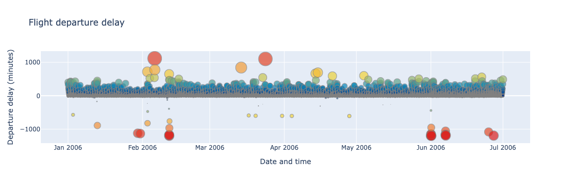
Below is a demonstration of zooming in and out of the generated figure.
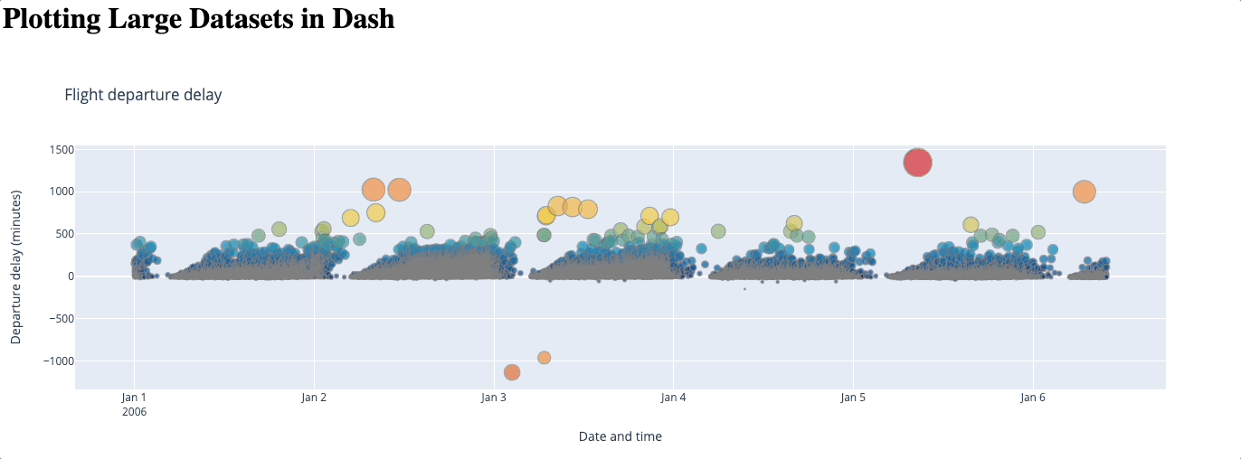
Beyond its simplicity, a big advantage of using WebGL is that no data is lost. However, as the number of data points increases, this method could become slower and even freeze: since it renders your graph using your GPU, how well it performs entirely depends on your hardware. Some users have also reported issues with browser compatibility.
For larger datasets that WebGL struggles to render, it is often optimal to downsample the dataset so that we can visualize the data using much fewer data points without losing significant details.
A simple approach is to average the values of data points close to each other. In the below example, I took the mean of all delay times with the same departure date and time.
# Take average of delay based on departure datetime
df = pd.read_csv("data/flights-3m-cleaned.csv").groupby(["DEP_DATETIME"], as_index=False).mean()

fig = go.Figure() # Initiate the figure.

fig.add_trace(go.Scattergl(
    x=df["DEP_DATETIME"],
    y=df["DEP_DELAY"],
    mode="markers", # Replace with "line-markers" if you want to display lines between time series data.
    showlegend=False,
    line_width=0.3,
    line_color="gray",
    marker={
            "color": abs(df["DEP_DELAY"]), # sets the color of each marker based on the data value
            "colorscale": "Portland", # defines the color scale used for the markers
            "size": abs(5 + df["DEP_DELAY"] / 50) # Non-negative size of individual data point marker based on the data value.
        }
    )
)

fig.update_layout(
    title="Flight departure delay",
    xaxis_title="Date and time",
    yaxis_title="Departure delay (minutes)"
)

fig.show()
The average approach is quite straightforward but you may notice that crucial information is missing. For example, the data points greater than 500 in January that were visible before have now vanished. No matter how we average the data, we risk giving the users a wrong impression of the dataset. We will look at a more effective approach below.
The plotly-resampler is an external library that dynamically aggregates time-series data respective to the current graph view. The library by default uses a downsampling algorithm named MinMaxLTTB, which is a more efficient implementation of the industry standard Largest-Triangle-Three-Buckets algorithm (LTTB). The LTTB algorithm preserves the visual characteristics of a dataset by selecting points that form the largest triangles within the data. This method maintains the overall shape and important features of the data, making it more effective for visualizations than the standard averaging method.
We initialize a figure by calling plotly_resampler.FigureResampler. We then add a go.Scatter figure, and specify the x-axis, y-axis, and the number of samples you want. It’s important to note that plotly-resampler only applies to time-series data, thus it is mandatory to sort the column in your dataset that you will be using as the x-axis.
Below is an example of a Dash app using plotly-resampler. A date range selector is included to facilitate easier viewing and navigation of the data. You can adjust the number of samples N based on your preference.
# app.py

from dash import dcc, html, Dash
import pandas as pd
import plotly.graph_objects as go
from plotly_resampler import FigureResampler

app = Dash(__name__)
server = app.server

N = 2000

df = pd.read_csv("data/flights-3m-cleaned.csv")

fig = FigureResampler(go.Figure())

fig.add_trace(go.Scatter(
        mode="markers", # Replace with "line-markers" if you want to display lines between time series data.
        showlegend=False,
        line_width=0.3,
        line_color="gray",
        marker_size=abs(5 + df["DEP_DELAY"] / 50), # Non-negative size of individual data point marker based on the data value.
        marker_colorscale="Portland", # defines the color scale used for the markers
        marker_color=abs(df["DEP_DELAY"]), # sets the color of each marker based on the data value
    ),
    hf_x=df["DEP_DATETIME"],
    hf_y=df["DEP_DELAY"],
    max_n_samples=N
)

app.layout = html.Div(children=[
    html.H1("Plotting Large Datasets in Dash"),
    dcc.Graph(id='example-graph', figure=fig),

])
Below is a demonstration of zooming in and out of the generated figure.
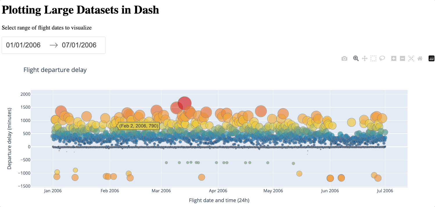
We can see that even with just 2000 samples, despite losing some details, the general characteristics of the dataset are still preserved, especially compared to the average approach. plotly-resampler is a convenient way to downsample the number of data points while still keeping a reasonable level of detail. However, a large number of data points will still be lost during the downsampling process. Additionally, introducing external libraries naturally incurs more complexity. Therefore, you should only use plotly-resampler if the dataset is too large for WebGL to handle.
It is also possible to leverage WebGL rendering by adding a Scattergl figure into the FigureResampler. With this combination, you get the benefits of both approaches and allow more sample data to be retained thanks to WebGL’s efficiency. This is often the preferred approach when using plotly-resampler for larger datasets barring any system limitations.
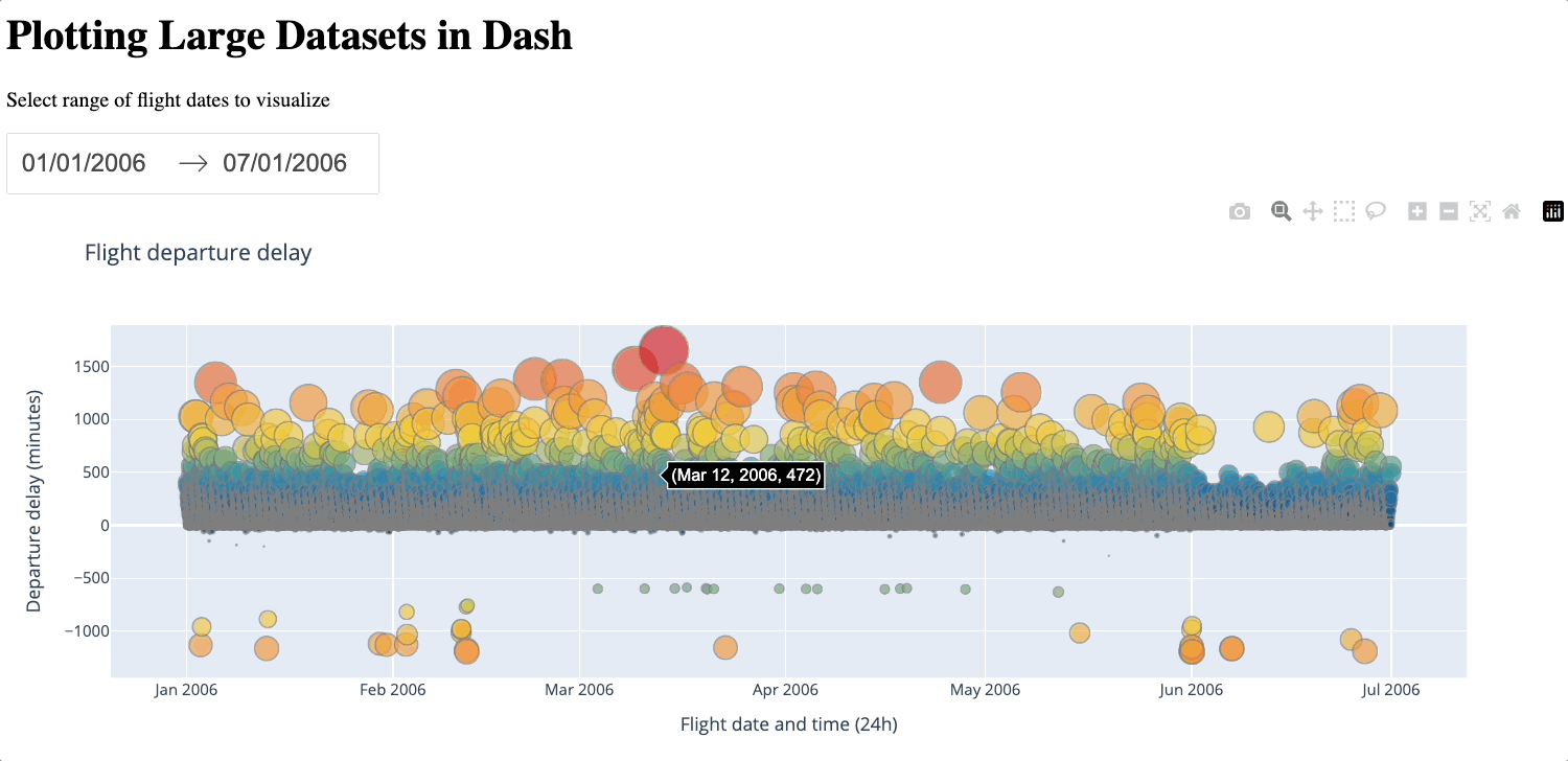
Below is an example of a Dash app using the combined approach. You can adjust the number of samples N based on your preference.
# app.py

from dash import dcc, html, Dash
import pandas as pd
import plotly.graph_objects as go
from plotly_resampler import FigureResampler

app = Dash(__name__)
server = app.server

N = 100000

df = pd.read_csv("data/flights-3m-cleaned.csv")

fig = FigureResampler(go.Figure())

fig.add_trace(go.Scattergl(
        mode="markers",
        showlegend=False,
        line_width=0.3,
        line_color="gray",
        marker={
            "color": abs(df["DEP_DELAY"]), # sets the color of each marker based on the data value
            "colorscale": "Portland", # defines the color scale used for the markers
            "size": abs(5 + df["DEP_DELAY"] / 50) # Non-negative size of individual data point marker based on the data value.
        }
    ),
    hf_x=df["DEP_DATETIME"],
    hf_y=df["DEP_DELAY"],
    max_n_samples=N
)

app.layout = html.Div(children=[
    html.H1("Plotting Large Datasets in Dash"),
    dcc.Graph(id='example-graph', figure=fig),

])
In the generated figure below, we can see that thanks to the larger sample size, the details that were lost between 0 and 500 previously are filled.
To download and deploy the apps, ensure you have installed our command-line interface and run ploomber-cloud examples followed by the example project’s repository directory. In this case:
ploomber-cloud examples dash/plotly-large-dataset
To test any of the apps locally, ensure that flights-3m-cleaned.csv is in the data folder and run gunicorn app:server run --bind 0.0.0.0:80
You should be able to access the content by visiting 0.0.0.0:80.
To deploy the applications on Ploomber, you can use our command-line interface or our website. Firstly, cd into the folder of the approach you want.
You can choose to use our command-line interface to deploy your app. The following files will be necessary:
To deploy, set your API key using ploomber-cloud key YOURKEY (how to find it), then run ploomber-cloud init to initialize the new app and ploomber-cloud deploy to deploy your app. For more details please check our guide.
We will use the Dash option to deploy to Ploomber Cloud. First, create a Ploomber Cloud account if you have not done so. To deploy the app, we upload a .zip file containing the following files:
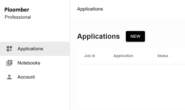
Now that you have your zip file prepared and you are logged into Ploomber Cloud, you should see this screen:
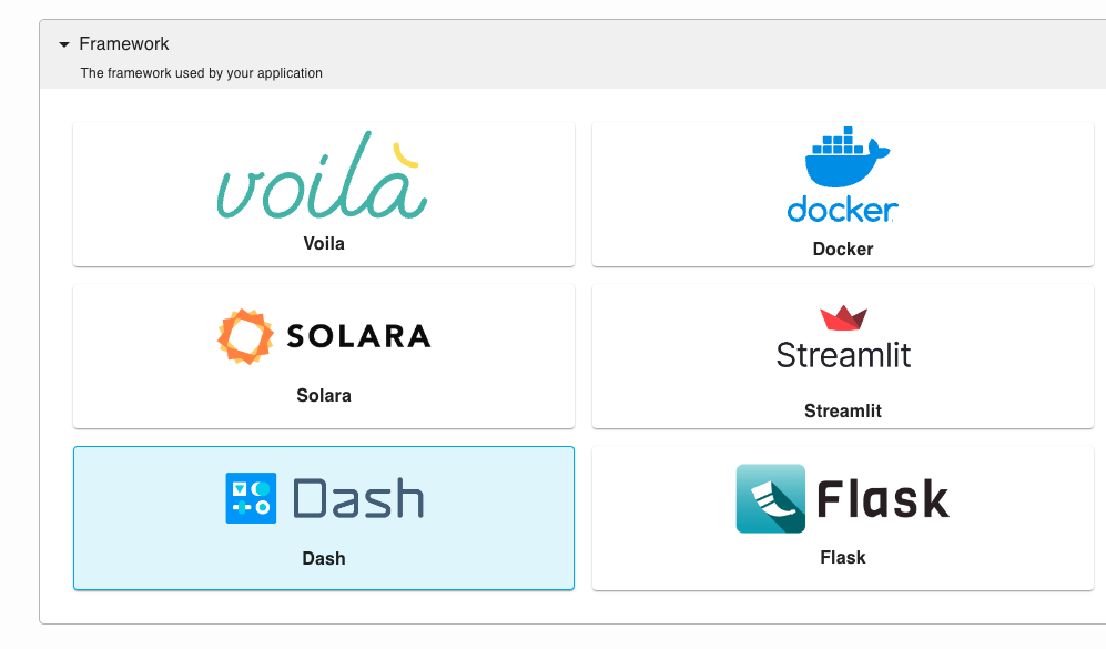
Click on NEW, select Dash under Framework, and upload your zip file.

Click Create and the website will automatically deploy. Once it is deployed, you will be able to access the URL.
And there we go! We have implemented two approaches to handling large datasets in Plotly Dash and deployed them to Ploomber Cloud. WebGL is often good enough for datasets with no more than 100,000-200,000 data points depending on your GPU, while plotly-resampler is more suitable for downsampling larger datasets. In many cases, the best approach is to combine the two to leverage the benefits of both.
Seamless deployment for data scientists and developers. Ploomber handles infrastructure so you focus on building. Secure and scalable—from personal projects to enterprise apps. Support for Streamlit, Dash, Docker, and AI-powered applications. Because life's too short for deployment headaches.