


Struggling to get Python packages installed? Get a pre-configured JupyterLab instance for free! Sign up for Ploomber Platform!
To produce a binary response, classifiers output a real-valued score that is thresholded. For example, logistic regression outputs a probability (a value between 0.0 and 1.0); and observations with a score equal to or higher than 0.5 produce a positive binary output (many other models use the 0.5 threshold by default).
However, using the default 0.5 threshold is suboptimal. In this blog post, I’ll show you how you can choose the best threshold from your binary classifier. We’ll be using Ploomber to execute our experiments in parallel and sklearn-evaluation to generate the plots.
Let’s continue with the example of training a logistic regression. Let’s imagine we’re working on a content moderation system, and our model should flag posts (images, videos, etc.) that contain harmful content; then, a human will take a look and decide whether the content is taken down.
The following snippet trains our classifier:
import matplotlib.pyplot as plt
import matplotlib as mpl
from sklearn import datasets
from sklearn.linear_model import LogisticRegression
from sklearn.model_selection import train_test_split
from sklearn_evaluation.plot import ConfusionMatrix

# matplotlib settings
mpl.rcParams['figure.figsize'] = (4, 4)
mpl.rcParams['figure.dpi'] = 150

# create sample dataset
X, y = datasets.make_classification(1000, 10, n_informative=5, class_sep=0.4)
X_train, X_test, y_train, y_test = train_test_split(X, y, test_size=0.3)

# fit model
clf = LogisticRegression()
_ = clf.fit(X_train, y_train)
Let’s now make predictions on the test set and evaluate performance via a confusion matrix:
# predict on the test set
y_pred = clf.predict(X_test)

# plot confusion matrix
cm_dot_five = ConfusionMatrix(y_test, y_pred)
cm_dot_five
Console output (1/1):

A confusion matrix summarizes the performance of our model in four regions:
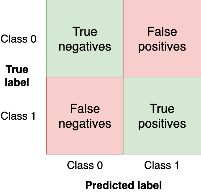
We want to get as many observations as we can (from the test set) in the upper-left and bottom-right quadrants since those are observations that our model got right. The other quadrants are model mistakes.
Changing the threshold of our model will change the values in the confusion matrix. In the previous example, we used the clf.predict function, which returns a binary response (i.e., uses 0.5 as threshold); however, we can use the clf.predict_proba function to get the raw probability and use a custom threshold:
y_score = clf.predict_proba(X_test)
Let’s now make our classifier a bit more aggressive by setting a lower threshold (i.e., flag more posts as harmful) and create a new confusion matrix:
cm_dot_four = ConfusionMatrix(y_score[:, 1] >= 0.4, y_pred)
Let’s compare both matrices. The sklearn-evaluation library allows us to do that easily:
cm_dot_five + cm_dot_four
Console output (1/1):

The upper triangles are from our 0.5 threshold, and the lower ones are from the 0.4 threshold. A few things to notice:
0 for the same number of observations (this is a coincidence)0.5 threshold: (90 + 56 = 146)0.4 threshold: (78 + 68 = 146)68 from 56)154 from 92)As you can see, the tiny threshold changes hugely affected the confusion matrix. However, we’ve only analyzed two threshold values. Let’s analyze model performance across all values to understand the threshold dynamics better. But before that, let’s define new metrics we’ll use for model evaluation.
So far, we’ve evaluated our models with absolute numbers. To ease comparison and evaluation, we’ll now define two normalized metrics (they take values between 0.0 and 1.0).
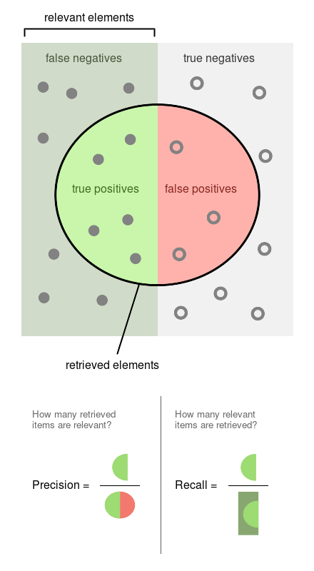
Precision is the proportion of flagged observations that are events (i.e., posts that our model thinks are harmful, and they are). On the other hand, recall is the proportion of actual events that our model retrieves (i.e., from all the harmful posts, which proportion of them we’re able to detect).
You can see both definitions graphically in the following diagram (Source: Wikipedia)
Since both precision and recall are proportions, they are on the same zero-to-one scale. So let’s now proceed to run the experiments.
We’ll obtain the precision, recall, and other statistics along several threshold values to better understand how the threshold affects them. We’ll also repeat the experiment multiple times to measure the variability.
Note: the commands in this section are bash commands. Execute them in a terminal or add the %%sh magic if using Jupyter.
import shutil
shutil.rmtree('threshold-selection')
ploomber cloud products --delete 'threshold-selection/*'
Console output (1/1):
Nothing to delete: no files matched the criteria.
To efficiently scale our work, we’ll run our experiments using Ploomber Cloud. It allows us to run experiments in parallel and retrieve the results quickly.
We created a notebook that fits one model and computes the statistics for several threshold values. We’ll execute the same notebook 20 times in parallel. First, let’s download the notebook:
curl -O https://raw.githubusercontent.com/ploomber/posts/master/threshold/fit.ipynb
Console output (1/1):
% Total    % Received % Xferd  Average Speed   Time    Time     Time  Current
                                 Dload  Upload   Total   Spent    Left  Speed
100 76611  100 76611    0     0   197k      0 --:--:-- --:--:-- --:--:--  197k
Let’s execute the notebook (the configuration in the notebook file tells Ploomber Cloud to run it 20 times in parallel):
ploomber cloud nb fit.ipynb
Console output (1/1):
Uploading fit-f57eca19.ipynb...
Triggering execution of fit-f57eca19.ipynb...
Done. Monitor Docker build process with:
  $ ploomber cloud logs e07126d7-f5cf-4de2-a50b-1d16e3fd9d62 --image --watch
After a few minutes, we’ll see that our 20 experiments are finished:
ploomber cloud status @latest --summary
Console output (1/1):
status      count
--------  -------
finished       20

Pipeline finished. Check outputs:
  $ ploomber cloud products
Let’s download the results from each experiment. The results are stored in .csv files:
ploomber cloud download 'threshold-selection/*.csv' --summary
Console output (1/1):
Downloaded 40 files.
We’ll now load the results of all experiments and plot them all at once.
The left scale (zero to one) measures our three metrics: precision, recall, and F1. The F1 score is the harmonic mean between precision and recall, the best value of the F1 score is 1.0 and the worst is 0.0; F1 values both precision and recall equally so you can see it as balancing between the two. If you are working on a use case where both precision and recall are important, maximizing F1 is an approach that can help you optimize your classifier’s threshold.
We also included a red curve (scale on the right side) showing the number of cases that our model flagged as harmful content. This statistic is relevant because there’s a limit on the number of events we can intervene in many real-world use cases.
Following our content moderation example, we might have an X number of people looking at the posts flagged by our model, and there’s a limit on how many they can review. Hence, considering the number of flagged cases can help us better choose a threshold: there’s no benefit in finding 10,000 daily cases if we can only review 5,000. And it’d be wasteful for our model to only flag 100 daily cases if we have more capacity than that.
from glob import glob

import pandas as pd
import numpy as np
paths = glob('threshold-selection/**/*.csv')
metrics = [pd.read_csv(path) for path in paths]
for idx, df in enumerate(metrics):
    plt.plot(df.threshold, df.precision, color='blue', alpha=0.2,
             label='precision' if idx == 0 else None)
    plt.plot(df.threshold, df.recall, color='green', alpha=0.2,
             label='recall' if idx == 0 else None)
    plt.plot(df.threshold, df.f1, color='orange', alpha=0.2,
             label='f1' if idx == 0 else None)


plt.grid()
plt.legend()
plt.xlabel('Threshold')
plt.ylabel('Metric value')

for handle in plt.legend().legendHandles:
    handle.set_alpha(1)

ax = plt.twinx()

for idx, df in enumerate(metrics):
    ax.plot(df.threshold, df.n_flagged,
            label='flagged' if idx == 0 else None,
            color='red', alpha=0.2)

plt.ylabel('Flagged')
ax.legend(loc=0)
ax.legend().legendHandles[0].set_alpha(1)
Console output (1/1):
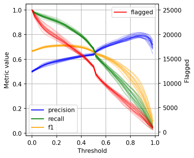
As you can see, when setting low thresholds, we have high recall (we retrieve a large proportion of actually harmful posts) but low precision (there are many non-harmful flagged posts). However, if we increase the threshold, the situation reverses: recall goes down (we missed many harmful posts), but precision is high (most flagged posts are harmful).
When choosing a threshold for our binary classifier, we must compromise on the precision or recall since no classifier is perfect. So let’s discuss how you can reason about choosing the suitable threshold.
The data gets noisy on the right side (larger threshold values). So, to clean it up a bit, we’ll re-create the plot, but this time, I’ll plot the 2.5%, 50%, and 97.5% percentiles instead of plotting all values.
shape = (df.shape[0], len(metrics))
precision = np.zeros(shape)
recall = np.zeros(shape)
f1 = np.zeros(shape)
n_flagged = np.zeros(shape)
for i, df in enumerate(metrics):
    precision[:, i] = df.precision.values
    recall[:, i] = df.recall.values
    f1[:, i] = df.f1.values
    n_flagged[:, i] = df.n_flagged.values
precision_ = np.quantile(precision, q=0.5, axis=1)
recall_ = np.quantile(recall, q=0.5, axis=1)
f1_ = np.quantile(f1, q=0.5, axis=1)
n_flagged_ = np.quantile(n_flagged, q=0.5, axis=1)
def get_interval(s):
    lower = np.quantile(s, q=0.025, axis=1)
    upper = np.quantile(s, q=0.975, axis=1)
    return lower, upper

precision_interval = get_interval(precision)
recall_interval = get_interval(recall)
f1_interval = get_interval(f1)
n_flagged_interval = get_interval(n_flagged)
plt.plot(df.threshold, precision_, color='blue', label='precision')
plt.plot(df.threshold, recall_, color='green', label='recall')
plt.plot(df.threshold, f1_, color='orange', label='f1')

plt.fill_between(df.threshold, precision_interval[0],
                 precision_interval[1], color='blue',
                 alpha=0.2)

plt.fill_between(df.threshold, recall_interval[0],
                 recall_interval[1], color='green',
                 alpha=0.2)


plt.fill_between(df.threshold, f1_interval[0],
                 f1_interval[1], color='orange',
                 alpha=0.2)
plt.xlabel('Threshold')
plt.ylabel('Metric value')
plt.legend()

ax = plt.twinx()
ax.plot(df.threshold, n_flagged_, color='red', label='flagged')
ax.fill_between(df.threshold, n_flagged_interval[0],
                n_flagged_interval[1], color='red',
                alpha=0.2)

ax.legend(loc=3)

plt.ylabel('Flagged')
plt.grid()
Console output (1/1):
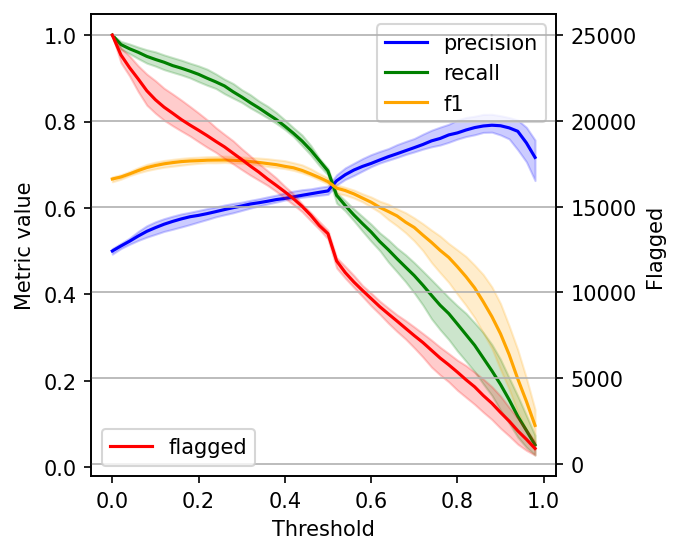
When choosing a threshold, we can ask ourselves: is it more important to retrieve as many harmful posts as possible (high recall)? Or is it more important to have high certainty that the ones we flag are harmful (high precision)?
If both are equally important, one common way to optimize under these conditions is to maximize the F-1 score:
idx = np.argmax(f1_)
prec_lower, prec_upper = precision_interval[0][idx], precision_interval[1][idx]
rec_lower, rec_upper = recall_interval[0][idx], recall_interval[1][idx]
threshold = df.threshold[idx]

print(f'Max F1 score: {f1_[idx]:.2f}')
print('Metrics when maximizing F1 score:')
print(f'  - Threshold: {threshold:.2f}')
print(f'  - Precision range: ({prec_lower:.2f}, {prec_upper:.2f})')
print(f'  - Recall range: ({rec_lower:.2f}, {rec_upper:.2f})')
Console output (1/1):
Max F1 score: 0.71
Metrics when maximizing F1 score:
  - Threshold: 0.26
  - Precision range: (0.58, 0.61)
  - Recall range: (0.86, 0.90)
However, it’s hard to decide what to compromise in many situations, so incorporating some constraints will help.
Say we have ten people reviewing harmful posts, and they can check 5,000 posts together. Let’s see our metrics if we fix our threshold, so it flags approximately 5,000 posts:
idx = np.argmax(n_flagged_ <= 5000)

prec_lower, prec_upper = precision_interval[0][idx], precision_interval[1][idx]
rec_lower, rec_upper = recall_interval[0][idx], recall_interval[1][idx]
threshold = df.threshold[idx]

print('Metrics when limiting to a maximum of 5,000 flagged events:')
print(f'  - Threshold: {threshold:.2f}')
print(f'  - Precision range: ({prec_lower:.2f}, {prec_upper:.2f})')
print(f'  - Recall range: ({rec_lower:.2f}, {rec_upper:.2f})')
Console output (1/1):
Metrics when limiting to a maximum of 5,000 flagged events:
  - Threshold: 0.82
  - Precision range: (0.77, 0.81)
  - Recall range: (0.25, 0.36)
However, when presenting the results, we might want to show a few alternatives: the model performance under the current constraints (5,000 posts) and how better we could do if we increase the team (e.g., by doubling the size).
The optimal threshold for your binary classifier is the one that optimizes for business outcomes and takes into account process limitations. With the processes described in this post, you’re better equipped to decide the optimal threshold for your use case.
If you have questions about this post, feel free to ask in our Slack community, which gathers hundreds of data scientists worldwide.
Also, remember to sign up for Ploomber Cloud! There’s a free tier! It’ll help you quickly scale up your analysis without dealing with complex cloud infrastructure.
Here are the package versions we used when writing this post:
pip freeze | grep -Ei 'matplotlib|sklearn|scikit-learn|ploomber'
Console output (1/1):
matplotlib==3.6.2
matplotlib-inline==0.1.6
ploomber==0.21.6
ploomber-core==0.0.6
ploomber-engine==0.0.10
ploomber-scaffold==0.3.1
scikit-learn==1.1.3
sklearn-evaluation==0.7.8
Seamless deployment for data scientists and developers. Ploomber handles infrastructure so you focus on building. Secure and scalable—from personal projects to enterprise apps. Support for Streamlit, Dash, Docker, and AI-powered applications. Because life's too short for deployment headaches.

