


Looking to host Voilà apps? Do it for free with Ploomber Platform!
In this blog post, we will explore how to deploy an end to end data application using JupySQL to extract data from databases and Voilà to create interactive web applications - all from a Jupyter notebook!
Voilà is an open-source tool that allows users to turn their Jupyter notebooks into standalone web applications. With Voilà, Jupyter notebooks can be transformed into interactive dashboards or applications with no need for additional coding. Voilà renders Jupyter notebooks as standalone web applications that run on a dedicated Jupyter kernel. This kernel executes callbacks for changes in interactive widgets in real-time, making it perfect for creating live data visualizations.
JupySQL is a SQL client for Jupyter that allows you to execute SQL queries within your notebooks. JupySQL can be used to extract data from databases and display it within a notebook.
A supermarket is offering a new line of organic products. The supermarket’s management wants to determine which customers are likely to purchase these products.
The supermarket has a customer loyalty program. As an initial buyer incentive plan, the supermarket provided coupons for the organic products to all of the loyalty program participants and collected data that includes whether these customers purchased any of the organic products.
This tutorial uses a subset of data sourced from Kaggle.
Use JupySQL and bqplot to generate visualizations, and share your results as a Voila dashboard.
Ensure you create the following:
A requirements.txt file with the following dependencies
voila>=0.1.8
ipyvuetify>=0.1.9
voila-vuetify>=0.0.1a6
bqplot
numpy
duckdb-engine
jupysql
ipywidgets
kaggle
A Jupyter notebook called organics-dashboard-ipynb
Using your terminal on Linux or Mac, or the Conda terminal on Windows, execute the following commands:
conda create --name voila-tutorial python=3.10 -y
pip install -r requirements.txt
voila organics-dashboard.ipynb
To obtain the data, ensure you log in and obtain an API key from Kaggle by visiting your account, going to the API section, and pressing Generate New API token. This will download a kaggle.json file.
Afterwards, follow these instructions
mkdir ~/.kaggle
mv kaggle.json ~/.kaggle/
chmod 600 ~/.kaggle/kaggle.json
Once that is completed, the following code can be added to organics-dashboard.ipynb
We first ensure the correct imports are included
import ipywidgets as widgets
from bqplot import (
    Axis, LinearScale, OrdinalScale,
    Figure, Bars, Scatter
)
import numpy as np
from bqplot import ColorScale
import ipyvuetify as v
import ipywidgets as widgets
from ipywidgets import interact, interact_manual, IntSlider, Dropdown
import kaggle
import pandas as pd
Download data using Kaggle API.
# Download the data
kaggle.api.authenticate()
kaggle.api.dataset_download_files('papercool/organics-purchase-indicator', path='./', unzip=True)
Perform data cleaning.
# Perform data cleaning
df = pd.read_csv('organics.csv')
df = df.dropna()

# Rename columns: substitute spaces with underscores
df.columns = [c.replace(' ', '_') for c in df.columns]

# Convert Affluence_Grade, Age, Frequency_Percent to numeric
df['Affluence_Grade'] = pd.to_numeric(df['Affluence_Grade'], errors='coerce')
df['Age'] = pd.to_numeric(df['Age'], errors='coerce')
df['Frequency_Percent'] = pd.to_numeric(df['Frequency_Percent'], errors='coerce')

# Save the cleaned dataframe to local CSV file
df.to_csv('organics_cleaned.csv', index=False)
We then initialize in memory DuckDB database instance using JupySQL’s %sql magic.
%load_ext sql
%sql duckdb://
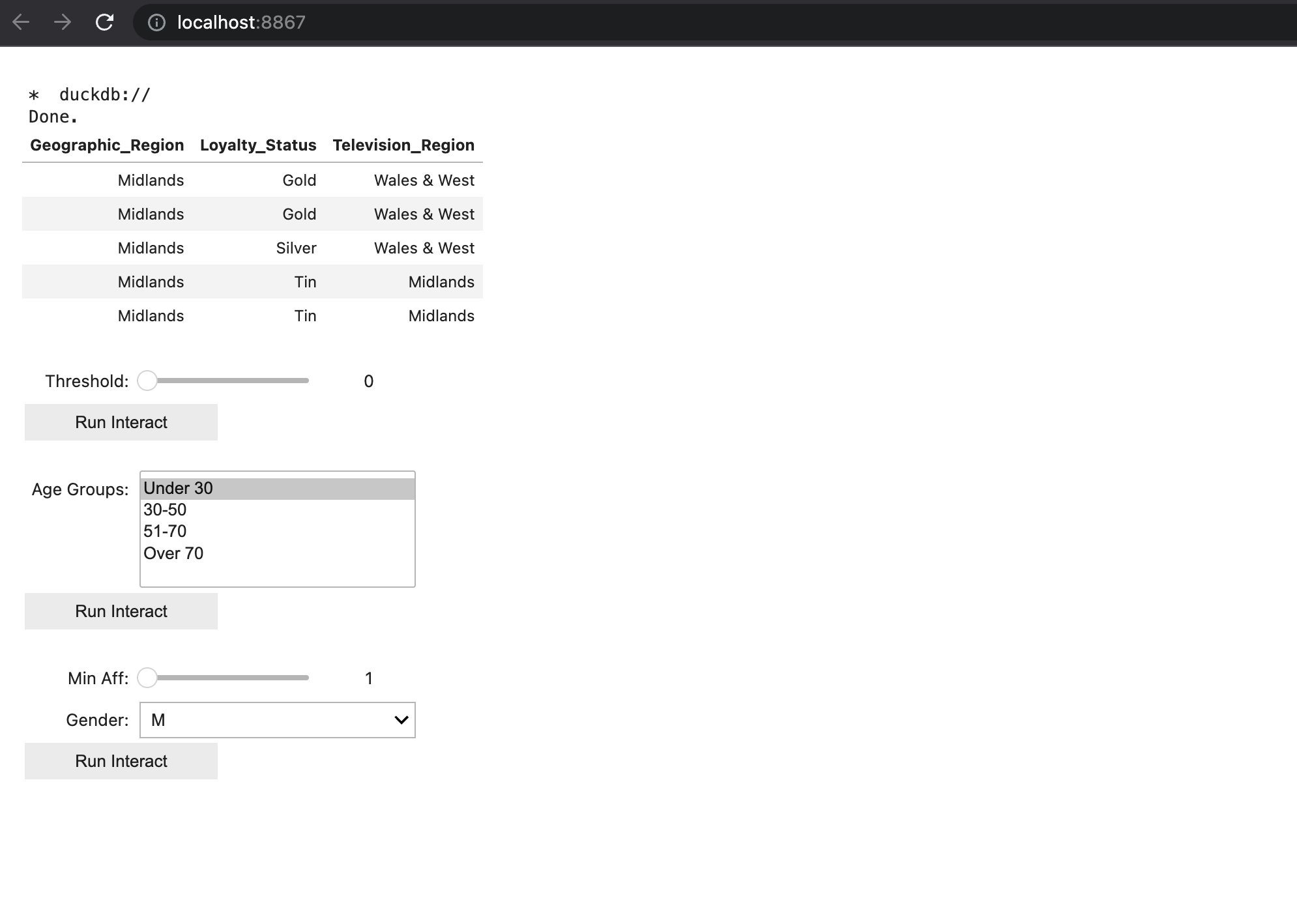
Taking a look at the first 5 rows with JupySQL’s %%sql magic.
%%sql
SELECT Geographic_Region, Loyalty_Status, Television_Region FROM organics_cleaned.csv LIMIT 5
Console output (1/2):
*  duckdb://
Done.
Console output (2/2):
| Geographic_Region | Loyalty_Status | Television_Region |
|---|---|---|
| Midlands | Gold | Wales & West |
| Midlands | Gold | Wales & West |
| Midlands | Silver | Wales & West |
| Midlands | Tin | Midlands |
| Midlands | Tin | Midlands |
In this section, we cover:
We are going to use JupySQL’s %sql magic when performing the queries, then visualize results and connect to ipywidgets for an interactive experience.
We start with a few helper functions.
# Define the function that will be called when the button is clicked
def bar_chart(df, x_col, y_col, title):
    """

    Parameters
    ----------
    df : pandas.DataFrame
        The dataframe to plot.
    x_col : str
        Name of column to plot, x axis
    y_col: str
        Name of column to plot, y axis
    title: str
        Title of the plot

    Returns:
    fig: bqplot.Figure
        The figure to plot.
    """
    # Create the scales
    x_ord_scale = OrdinalScale()
    y_lin_scale = LinearScale()
    color_scale = ColorScale(scheme='viridis')

    # Create the axes
    x_axis = Axis(scale=x_ord_scale, label=x_col)
    y_axis = Axis(scale=y_lin_scale, orientation='vertical', label=y_col)

    # Create the bar values
    x = df[x_col].values
    y = df[y_col].values

    # Sort organics_sold in descending order and get the sorted indices
    sorted_indices = np.argsort(y)[::-1]

    # Apply the sorted indices to both organics_sold and regions
    sorted_y = y[sorted_indices]
    sorted_x = x[sorted_indices]

    # Create the bar chart
    bar_chart = Bars(
        x=sorted_x,
        y=sorted_y,
        scales={'x': x_ord_scale, 'y': y_lin_scale, 'color': color_scale}
    )

    # Create the figure
    fig = Figure(marks=[bar_chart], axes=[x_axis, y_axis], title=title)
    return fig

def scatter_plot(df, x, y, title):
    """

    Parameters
    ----------
    df : pandas.DataFrame
        The dataframe to plot.
    x : str
        Name of column to plot, x axis
    y: str
        Name of column to plot, y axis
    title: str
        Title of the plot

    Returns:
    fig: bqplot.Figure
        The figure to plot.
    """

    # Create the scales
    x_scale = LinearScale()
    y_scale = LinearScale()

    # Create the scatter plot
    scatter_chart = Scatter(
        x=df[x],
        y=df[y],
        scales={'x': x_scale, 'y': y_scale},
        default_size=64,
    )

    # Create the axes
    x_axis = Axis(scale=x_scale, label=x)
    y_axis = Axis(scale=y_scale, label=y, orientation='vertical')

    fig = Figure(marks=[scatter_chart], axes=[x_axis, y_axis], title=title)
    return fig


def set_fig_layout(fig, width, height, min_height):
    """

    Parameters
    ----------
    fig : bqplot.Figure
        The figure to plot.
    width : int
        Width of the plot.
    height: int
        Height of the plot.
    min_height: int
        Minimum height of the plot.

    """
    fig.layout.width = width
    fig.layout.height = height
    fig.layout.min_width = min_height
    return fig
Q: Count number of purchases by region, where organic purchases were made. Pick a “threshold” to select the minimum number of purchases made.
We can answer that question via a query.
Note that the query uses parameterization via the notation {{}} and is executed using JupySQL’s %sql magic.
# Function to execute the SQL query and return a DataFrame
def get_organics_by_threshold(threshold):
    query = f"""
    SELECT Television_Region, COUNT(*) as NUM_Purchases
    FROM organics_cleaned.csv
    WHERE Organics_Purchase_Indicator = 1
    GROUP BY Television_Region
    HAVING COUNT(*) >= {threshold}
    """
    print("Performing query")
    # Use JupySQL magic %sql to execute the query
    result = %sql {{query}}
    # Convert the result to a pandas DataFrame
    organics_by_threshold_df = result.DataFrame()

    # Create the bar chart
    fig_bar_geo = bar_chart(organics_by_threshold_df,  'Television_Region', 'NUM_Purchases', 'Number of organic purchases made by region')
    fig_bar_geo = set_fig_layout(fig_bar_geo, 'auto', '400px', '300px')
    display(organics_by_threshold_df)
    display(fig_bar_geo)

# Create a variable for the threshold selection
threshold = widgets.IntSlider(
    min=0, max=1000, step=100, value=0,
    description='Threshold:',
    disabled=False,
)


# Use ipywidgets.interact_manual to create a dynamic interface
interact_manual(get_organics_by_threshold, threshold=threshold);
Console output (1/1):
interactive(children=(IntSlider(value=0, description='Threshold:', max=1000, step=100), Button(description='Ru…
Q: What groups have the highest number of organic purchases (broke down by age group and gender)?
We can answer that question via a query such as:
def get_age_group_purchase(age_groups):
    global age_group_purchase_df
    query = f"""
    SELECT Gender, Age_Group, AVG(Total_Spend) as Average_Total_Spend
    FROM (
        SELECT Gender,
            CASE
                WHEN Age < 30 THEN 'Under 30'
                WHEN Age BETWEEN 30 AND 50 THEN '30-50'
                WHEN Age BETWEEN 51 AND 70 THEN '51-70'
                ELSE 'Over 70'
            END as Age_Group,
            Total_Spend
        FROM organics_cleaned.csv
        WHERE Organics_Purchase_Indicator = 1
    ) as subquery
    WHERE Age_Group IN {age_groups}
    GROUP BY Gender, Age_Group

    """
    # Use JupySQL magic %sql to execute the query
    print("Performing query")
    result = %sql {{query}}
    # Convert the result to a pandas DataFrame
    age_group_purchase_df = result.DataFrame()

    # Create the bar chart
    fig_bar_gender = bar_chart(age_group_purchase_df, 'Gender', 'Average_Total_Spend', 'Average total expenses of Purchases by age group and gender')
    fig_bar_gender = set_fig_layout(fig_bar_gender, 'auto', '400px', '300px')

    display(age_group_purchase_df)
    display(fig_bar_gender)

# Create a variable for the age group selection
age_groups = widgets.SelectMultiple(
    options=['Under 30', '30-50', '51-70', 'Over 70'],
    value=['Under 30'],
    description='Age Groups:',
    disabled=False,
)

# Use ipywidgets.interact to create a dynamic interface
interact_manual(get_age_group_purchase, age_groups=age_groups);
Console output (1/1):
interactive(children=(SelectMultiple(description='Age Groups:', index=(0,), options=('Under 30', '30-50', '51-…
Q: What patterns can you uncover between the average funds spent on organic purchases, the number of purchases, gender and affluence grade?
We can answer that question via a query such as:
def get_purchased_by_affluence(affluence_min, selected_gender):
    query = f"""
    SELECT Affluence_Grade, COUNT(*) as Num_Purchased, AVG(Total_Spend) as AVG_Expenses
    FROM organics_cleaned.csv
    WHERE Organics_Purchase_Indicator = 1 AND Affluence_Grade >= {affluence_min} AND Gender = '{selected_gender}'
    GROUP BY Affluence_Grade
    ORDER BY Affluence_Grade
    """
    print("Performing query")
    # Use JupySQL magic %sql to execute the query
    result = %sql {{query}}
    # Convert the result to a pandas DataFrame
    aff_g_df =  result.DataFrame()

    # Create the scatter plot
    fig = scatter_plot(aff_g_df, 'AVG_Expenses', 'Num_Purchased', 'Number of Purchases vs Total Expenses by Affluence Grade and Gender')
    fig = set_fig_layout(fig, 'auto', '400px', '300px')
    display(fig)

# Create a variable for the affluence and gender selection
affluence_min = IntSlider(
    min=1, max=15, step=1, value=1,
    description='Min Aff:',
    disabled=False,
)

gender_dropdown = Dropdown(
    options=['M', 'F', 'U'],
    value='M',
    description='Gender:',
    disabled=False,
)

# Use ipywidgets.interact_manual to create a dynamic interface
interact_manual(get_purchased_by_affluence, affluence_min=affluence_min, selected_gender=gender_dropdown);
Console output (1/1):
interactive(children=(IntSlider(value=1, description='Min Aff:', max=15, min=1), Dropdown(description='Gender:…
Using your terminal, you can then execute the following command to build the dashboard locally.
voila organics-dashboard.ipynb
You can then visit http://localhost:8866/ to see your dashboard!
This is what it looks like before executing the query.
This is what it looks like after executing interactive query.
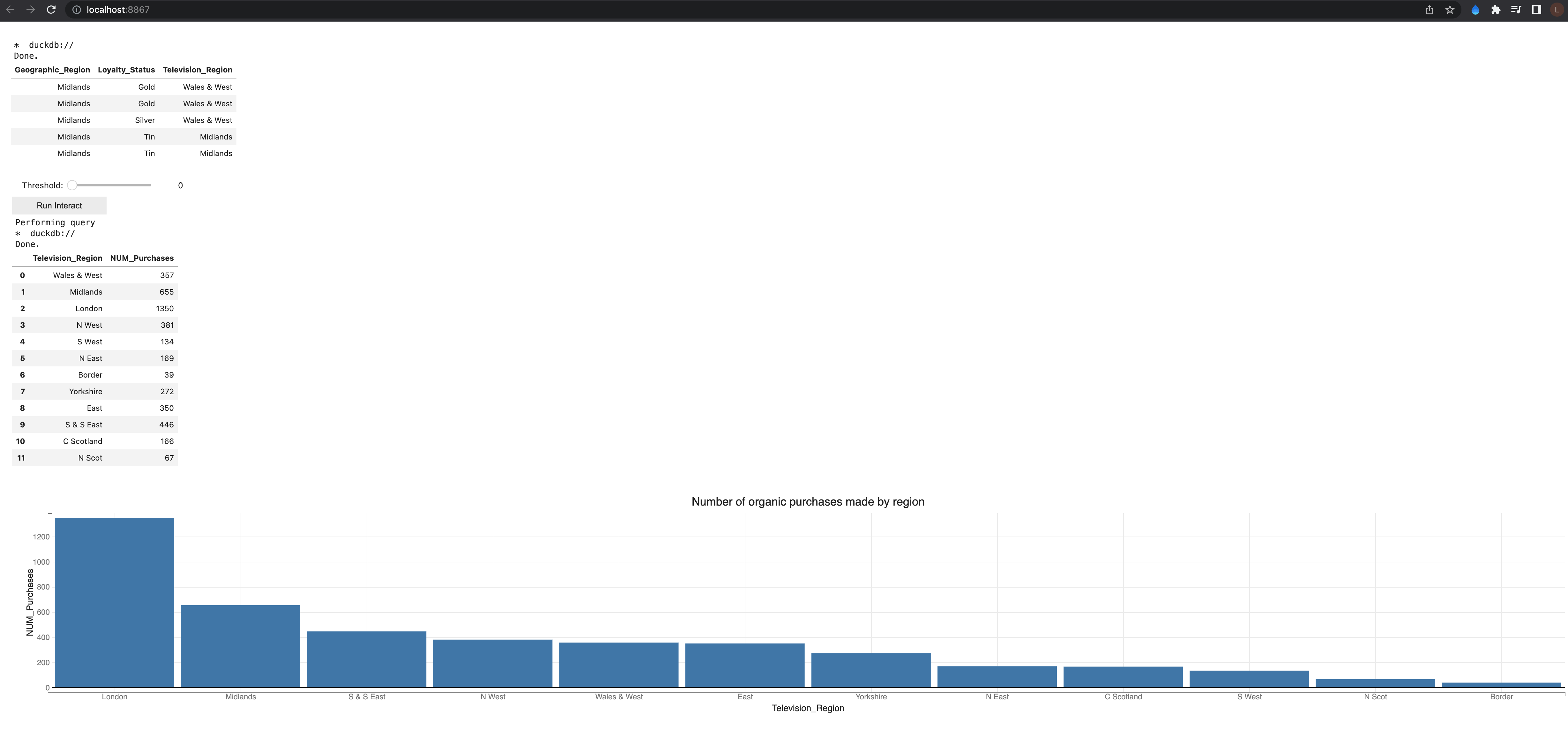
London had the highest number of organic purchases (over 1300), while Border had the lowest (39). It is possible the advertisement program is better set up at the capital that in smaller towns, and awareness of organic products is mainstream in larger cities. Males and Females over 70 had the highest number of average total expenses. In age groups of less than 30 or between 30 and 50, female customers consistently spent more on average than male customers. There appear to be clusters in the customer groups when evaluating average total expense vs number of purchases.
In this blog we explored ways to combine data exploration and wrangling wtih JupySQL via the %%sql magic, which allowed us to connect to a database, perform and save queries. We then converted those queries to dataframe format with the .DataFrame() method, and presented insights visually using the bqplot package. To finalize, we explored how to set up a Voilà local instance of the notebook. To deploy the dashboard, you can choose one of the following methods, as an example:
For more details, review this blog.
Seamless deployment for data scientists and developers. Ploomber handles infrastructure so you focus on building. Secure and scalable—from personal projects to enterprise apps. Support for Streamlit, Dash, Docker, and AI-powered applications. Because life's too short for deployment headaches.